Autumn at Paisnel Gallery

This week we visited Paisnel Gallery in St James's to view their Autumn collection. Paisnel Gallery specialises in 20th century art, with particular attention given to Post War art and the work of the St Ives group. 

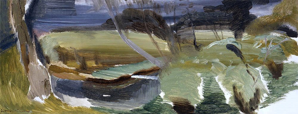
Among the paintings on display was this work by John Piper. The British landscape is a setting he returns to time and again and this work entitled ‘Portholland, Cornwall’ is a classic example of this. His paintings of towns have in many ways become archives of these sites. We were particularly intrigued in this work for its mixture of both figurative and abstract styles.

John Copnall's painting also caught our eye for its simple colour scheme. The work is mixed media and collage with overlaid and painted sections. His use of hessian, canvas and plaster was inspired by the work of Antoni Tapies. We like the materiality of the work, which, combined with a subtle colour scheme gives a wonderful texture.

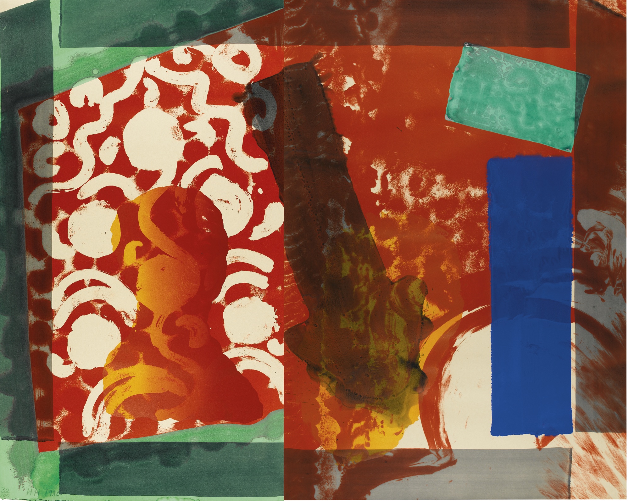
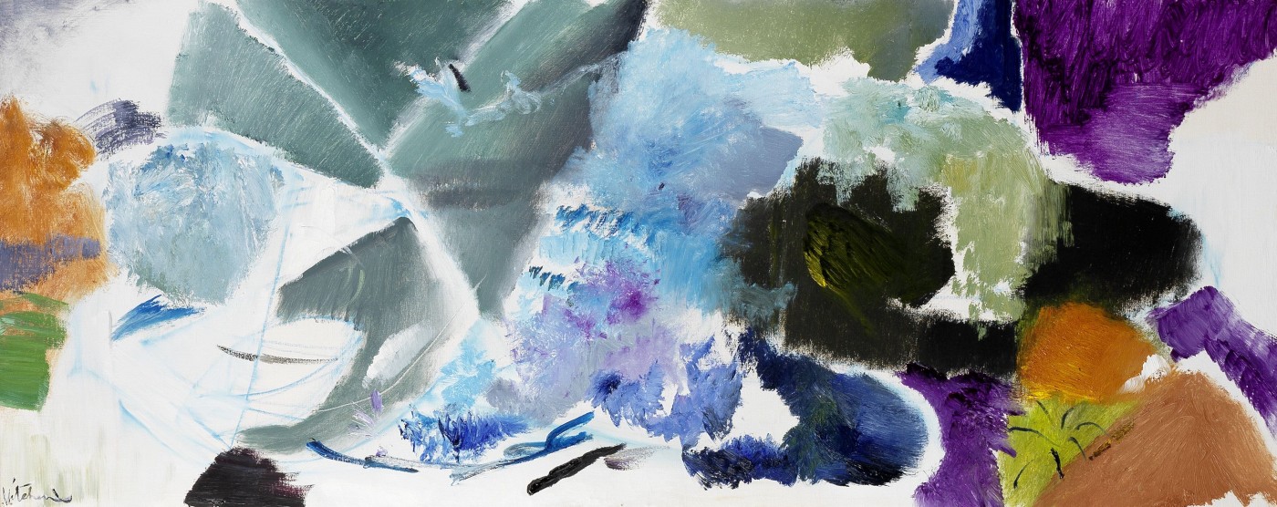
We have written about Howard Hodgkin's work before, his sense of energy really inspires us. This work, 'Put Out More Flags', immediately captured out attention for its colour, movement and energy. Characteristically, it is a hand coloured etching and the layering of colours is fluid and balanced. Although his prints were intricately hand crafted, he retains a sense of spontaneity which we love. A work like this could really enliven an interior and look splendid in a modern space.

The White Show at Flow Gallery

London is thriving with independent galleries showcasing the latest emerging and contemporary artists, one of our favourites in Flow Gallery in Notting Hill.

Flow Gallery currently has a beautiful little exhibition called ‘The White Show’ which showcases contemporary ceramics, glassware and jewellery that all work with the colour white.

Matthias Kaiser’s work tries to reveal his material process. He is interested in alchemical transformations of earth into stone and enjoys the diverse and accidental textures his ceramics build up while he works on them.

These miniature white pots are by Yuta Segawa. Segawa’s Japanese heritage is a primary inspiration and we love the simplicity and sense of playfulness in these works.

Do you enjoy visiting London's independent galleries? Let us know which galleries you get inspiration from in the comments section below.

Newport Street Gallery

This week we visited Damien Hirst's new gallery, Newport Street Gallery, which opened this month. The building is impressive in itself, 37,000 sq ft and has been designed by Caruso St John architects who recently worked on Tate Britain's revamp. The building was once a series of scenery painting workshops and retain an airy, warehouse feeling.

Rather than exhibiting Hirst's own work, the gallery will focus on six month exhibitions of one artist each time from Hirst's own collection. The gallery has opened with an exhibition of British abstract artist John Hoyland.

While the exhibition has been heavily criticised with reporters uninspired by Hoyland's work, we felt otherwise. The canvasses are vast, vibrant and pack a punch. We are often inspired by abstract works of art as their colours can be used as inspiration for an interior's colour scheme.

Abstract works like this can enliven a contemporary and minimal interior adding a splash of colour and character. Their boldness captivated us.


Robert Kime Book Launch

We had a lovely time at the launch of interior designer Robert Kime’s book this week at Christie’s HQ in London. The book is beautifully designed and its pages filled with stunning projects.

We have always admired Robert’s work, its remains timeless and elegant. His new book reflects on twelve of his favourite projects. There are stunning photographs and interesting stories about choices and challenges.

Alistair Langlands, the book’s writer, tells us for Robert “it is essential that a house or room should convey a sense of safety and a feeling of permanence”. This feeling of safety and permanence is created not through lavish decoration, but subtle and sensitive details that reflect the style of the existing space and add a homely but fresh atmosphere.

The book also captures exquisite details from his own homes, like this plaster cast of Roman ladies from the Met Museum of Art which is now in Robert’s house in Provence.

PAD London Art & Design Fair

Last week we visited PAD London Art and Design fair in London…

If you’re interested in buying modern art or design pieces for your home we always recommend visiting renowned fairs like PAD. If you’re unsure on what to chose, make sure you get talking to the exhibitors as they’re always on hand to answer questions and help you find pieces that work for your home. We also recommend taking photos of pieces that catch your eye and think about them when you return home.

We wanted to share some of the exhibitors and pieces that interested us, here's our favourites  …

Chahan Minassian brought some exquisite pieces over from his showroom in Paris. Chahan works as a designer, interior designer, antique dealer and gallery director so his eye for elegantly designed pieces is finely tuned. Inspired by luxury materials like bronze, lacquer and tortoiseshell, Chahan has designed his own line of furniture and lamps.

The simplicity of his designs combined with the luxury of materials gives his pieces an elegant timelessness that could work in both modern and classic interiors.

We were also taken by the pieces on sale from Magen H Gallery who were over from New York. They specialise in French post-war designers with an emphasis on craft mediums that merge art and design.

Their display included this dining table, below, by Sido and Francois Thevenin from 1970. The French husband and wife design team worked together labouring intensely over hand-forged pieces from wood and metal. 

Another exhibitor over from Paris was Jacques Hervouet who runs a gallery in Paris and custom designs furniture and accessories. For his custom pieces he enjoys mixing eras and blends both historic and contemporary designs, creating a style he calls ‘Radical Chic’. There is confidence and boldness that pervades both his collections and custom pieces which we love.


Fabric Inspiration

For this week’s blog we want to focus on fabrics.

When we work on an interior design project, we often make use of beautifully printed or painted fabrics. Whether you are choosing fabrics for furniture and small furnishings or larger wall coverings, it is crucial that the colour and design tie in with the look and feel of your interior - if you’re completely drawn to a fabric it can even inspire your overall colour scheme.

Elizabeth Eakins set up her rug and textile business in 1978, with a focus on making by hand. All of her fabrics are made from natural fibers and include linen, hemp and wool blends. We were particularly drawn to this natural hemp linen fabric, ‘Esther Young’ in azure and rose.

We also loved this fabric from Harlequin’s collection. The fabric has been digitally printed for accuracy with botanical-style representations of hummingbirds in beautiful and crisp colours. The detail is exquisite and would add both a splash of colour and a real sense character to either a classic or contemporary interior.

Turnell and Gigon distribute beautiful fabrics which range from both classic and contemporary designs. We loved these deigns in cream and blue colours, the coloured detail looks beautiful over these subtle backgrounds. 

'Made in Britain' // Sotheby's

We had a difficult decision choosing just a few of our favourites, but take a look at some of our highlights and let us know what caught your eye!

Howard Hodgkin’s work always catches our eye for its expressive colouring. The work below, entitled Moonlight (1980) is a beautiful lithograph printed in colours with additional hand-colouring. Hodgkin is one of Britain’s most important printmakers and painters and his bold style is completely captivating. Since the 1970s expressive patterning has dominated his work, combining printmaking techniques, bold brushstrokes and bright daubs of paint to produce punchy abstract works that would instantly enliven a room.

There is a finely balanced tension that we find interesting in Victor Pasmore’s work; the balance of saturated colour and fine black strikes. We were drawn to this piece entitled Senza Titolo (1991) for its unified hue. A work like this can really inform a colour scheme if you are designing a new interior, or help to tie together an existing colour scheme. We are inspired by works of art and their expressive colours and often use them as starting points for a new project’s colour scheme.

There was also a fantastic selection of ceramics on sale. The four pouring vessels by Rupert Spira, below left, are beautifully elegant in their shape and blue glaze. We were also drawn to the ceramic pieces on sale by Lucie Rie. The footed bowl, below centre, has a beautiful matt blue glaze and bronzed rim. On sale were also ceramics from one of Britain’s most respected and influential potters, Bernard Leach. The fluted bowl, below right, is made from porcelain with a celadon glaze. Its size, form and neutral glaze give it a sense of timeless elegance that would sit beautifully in either a modern or classic home.

We were also struck by the painting on sale by Mary Fedden. Fedden’s work is characterised by her use of bold, often contrasting, expressive colours. The vivid colours in the painted still life, below, left, with reds, purples and greens would really bright a vibrant splash of colour to a neutral room. We often enjoy pairing vibrant works of art with interiors that have muted colour schemes, and tie it in with details like cushions that work with the colours.

With the Tate’s major retrospective on this month, we were also looking out for works by Barbara Hepworth. The lithograph printed in black and yellow, below left, is beautifully harmonious and would perfectly compliment an interior with a muted and subtle colour scheme. The screen print, below right, by Ben Nicholson has been printed on woven silk. The delicate quality of the material blends beautifully with his subtle and sensitive colour scheme. Whether your interior is modern or classic, works of art that are elegant and subtle like this piece can really add charm to your home.

Decorex 2015

This year’s fair centred around the theme ‘The Future of Luxury’, focussing on an interpretation of luxury in terms of time taken to craft, material and collaborations.

Did you get a chance to visit? Let us know what stood out for you and if you were inspired by anything on display? In the meantime, here are some of our highlights from Decorex 2015.

We were drawn straight away to pieces on display from Tatiana Tafur who supply beautiful, made to order furniture. Much of their furniture is made with stunning high quality veneers and specialist materials like shagreen, parchment and painted lacquers. The ombre console below left stood out to us, it uses a combination of grey ombre gloss parchment and aqua shagreen drawers. 

We also loved the lighting range from anew company that we discovered at Decorex; Pooky. Pooky were exhibiting a charming range of lighting, their aim is to create high quality, beautifully finished designs but at affordable prices. They have a lovely selection of shades and stands, with both subtle tones and bright colours that really stand out, as well as printed fabrics with Mediterranean influences.

We were also drawn straight to Habibi’s Moroccan tiles. Habibi are the international leading specialists in hand-crafted Moroccan tiles and produce some really stunning pieces. 

London Design Festival 2015

We’ve loved seeing design installations popping up across London over the past week for this year’s London Design Festival. Its mission to pronounce London as the design capital is clear and compelling with so many hundreds of young and established designers proving their talent. There are some fantastic events taking place until the end of the month, so we’ve picked some of our must-see spots to make it easier for you.

First up is designjunction  from furniture to lighting to product design, designjunction is packed with inspiring designs. Staged in Victoria House and the old St Martins college building in Holborn, the designjunction flagship had a range of exhibitors showcasing cutting-edge brands, new labels and design pop-ups.

If you’re a Londoner reading this, you’ve probably already seen you twitter feed clogged up with photos of Charles Petillon’s Heartbeat installation in Covent Garden Market. Petillon has created a 54 metre stretch of white balloons with gently pulsating white lights to evoke a heartbeat. They appear almost cloudily and beautifully poetic.

Speaking of the work Petillon said: “The balloon invasions I create are metaphors. Their goal is to change the way in which we see the things we live alongside each day without really noticing them. With Heartbeat I wanted to represent the Market Building as the beating heart of this area – connecting its past with the present day to allow visitors to re-examine its role at the heart of London’s life.” The installation is completely free to walk around and up until September 27th.

Somerset House is also taking part this year, hosting a series of exhibitions and talks. Among them, one of our favourites is their 10 Designers in the West Wing exhibition. They’ve teamed up with the London Design Festival organisers to showcase 10 leading international designers including Nendo, Faye Toogood and Ross Lovegrove.

We particularly enjoyed Faye Toogood’s display of drawing rooms, redrafted as charcoal sketches on translucent plastic sheets that line the walls. She creates an atmospheric space to relax in.

There’s also a focus on new digital technology, with Tino Schaedler of Optimist Design joining with United Realities to take us on a journey in exploring both physical and virtual spaces and their connections. Free and open until September 27th, more info here.

Inspired by Works of Art - Agnes Martin and Sonia Delaunay

We’ve been struck by two recent exhibitions at Tate Modern this month – Agnes Martin and Sonia Delaunay. While their work is clearly aesthetically different, they are united in their focus on colour, tone and pattern.

Agnes Martin’s work sits within a tuning point between Abstract Expressionism and Minimalism. While living in Lower Manhattan she met the bright young artists of the 60s like Jasper Johns, Ellsworth Kelly and Robert Rauschenberg – they inspired her to start incorporating found objects to create assemblages.

She eventually turned to a more minimal approach, often using grid-like structures. We were struck by her subtly striped paintings, from a distance some appear almost monochrome but when viewed closer become alternating stripes of pastel tones. These muted tones are also very on trend – Tate has even created their own Pinterest board with interiors that follow an Agnes Martin inspired colour schemes!

Take a look here

Sonia Delaunay is well known for her exploration of dynamic contrasting colours and compositions, pioneering the movement ‘Simultaneism’ with her husband Robert Delaunay.

Delaunay was a key figure in the avant-garde movement in Paris and as well as fine art, she produced dresses, scarves, umbrellas, hats, shoes and swimming costumes. She also created some iconic and stunning carpet designs, seen below. Her focus on colour and harmony makes her a perfect artist for inspiration, whether you’re looking for a new bold colour scheme or to add splashes of colour into your interior, her confident colours would certainly stand out.

Her and Robert were influence by the strong colours of Fauvist artists and they tried to use these colours in their own work, with a greater focus on rhythm.

Christie's Interiors August 2015

Christie’s South Kensington is celebrating its 40th year with talks and events. This week we attended the Christie’s Interiors August auction and a talk on The Art of Interior Design with some great speakers including James McWhirter and Sarah Morris of McWhirter Morris.

We visit as many art, antiques and designs fairs as we can and are always on the lookout for unique pieces. Here are some of our favourite pieces from Christie’s Interiors August auction – the auction is on August 18th so do pop along to take a look at what’s on sale.

Alongside items of furniture are a stunning selection of 20th and 21st Century paintings. The work of Polish painter Zdzislaw Ruszkowski (1907-1991) particularly caught our eye. During the 1930s Ruszowski moved to France where he discovered the work of Cezanne and was hugely inspired by his colouring and Post-Impressionistic approach. There is a beautiful and sensitive lyricism in Ruszowski’s work, aided by his playful yet harmonious colour schemes.

We were also intrigued by these coloured chalk drawings by John Golding. The colour scheme, with subtle hints and richer tones could provide the perfect inspiration for an interior’s colour scheme. This is a great example of how one piece, like a work of art, can really influence and dictate your interior design choices.


Masterpiece London 2015 // Part II

Masterpiece is one of our favourite fairs. In our last blog post we showcased the pieces of jewellery and furniture that caught our eye at Masterpiece Fair 2015 in London. This time, we wanted to show you the beautiful works of art that shone our for us at the fair.

We always keep an eye out for artworks that could really help compliment an interior. We source artworks and furniture not only as part of a project but also as a one-off for clients so we're always keen to seek out new pieces on the market. If an artwork really captures your attention you can even use it's colouring as a starting point for your colour scheme, or use it to suit an existing palette to really help tie in your interior's colour scheme.

We are frequently drawn to paintings by Ivon Hitchens, so were drawn to Christopher Kingzett's stand who had several on display. Their tonality and semi-abstract nature can so perfectly compliment either a new or existing colour scheme, adding character and charm without dominating the space.

Philip Mould & Company also had a selection of works of art, as usual. They focus on British art and the Old Masters. They had several works by Welsh painter Augustus John. As well as being a painter, John was a draughtsman and etcher and is known for his portraiture work. For a brief period he worked in a post-impressionist style, which remained influential to his style although returning to a more classical approach. It is his beautiful and elegant sense of light and colour that appeals to us. He often sticks to a relatively close hued colour palette which means, if chosen well, his paintings can provide a harmony with an interior's existing colour scheme.

Masterpiece London 2015 // Part I

Masterpiece is one of London's stand-out Art & Antiques fairs. There were over 150 exhibitors with items on display that span 4,000 years of art and design history at this year's fair.

Did you visit Masterpiece this year? Let us know what items caught your eye.

Alongside antique furniture and works of art there were some pieces of jewellery on display. One exhibitor that really caught our attention was Veronique Bamps. Veronique has devoted herself to collecting European and American jewellery dating from the 19th Century to the 1950s. She had on display some classic pieces from renowned designers… take a look at the brooch below from 1966, platinum set with brilliant cut and baguette diamonds.

88-Gallery had some fantastic pieces of furniture and lighting on display. They are based between London, Belgium, Paris and Hong Kong so are able to source top pieces from across Europe and outside, particularly from France, Belgium and Italy. They had a selection of cabinets stunningly decorated with vibrant turquoise.

Another striking piece of furniture to catch our eye was this console table by Irish designer Joseph Walsh made from Olive Ash and glass on display from Peter Petrou. The piece is beautifully hand crafted in his studio in Cork and comes from his famous 'Enignum' series. He is inspired by his wild coastal surroundings in Ireland, the landscape he grew up with. He manipulates and bends the wood as far as he can, allowing its natural curves to come through creating undulating and sinuous forms that flow through each other. A console table like this would be a spectacular centre piece in a sitting room, especially in a country or coastal home where it could reflect its natural surroundings.

Art Antiques London 2015 Fair

We visited Art Antiques London 2015. On display were some amazing pieces from artworks, ceramics and jewellery to rare books, textiles and furniture. We loved the variety of the exhibits as well as the insightful lecture programme with experts travelling to share their knowledge.

aal2013.jpg

As always though, we were drawn to some very specific pieces – here’s a selection of our favourite pieces from the fair.

We were really struck by this unique piece on display at Christopher Buck Antiques. This French walnut shell-shaped stool (c.1860) most likely served as a stool for a harp of cello. The piece features a carved shell shaped seat on a triple leg cariole stand.

We are always looking out for artworks that can be incorporated into our clients interiors. The Canon Gallery had a display of modern paintings and we loved this red chalk and pencil drawing by Sir Edward Burne-Jones. The drawing stood out for us as it is a study for Andromeda, a popular female subject for Burne-Jones.

Another art dealer that we are always keen to follow is Anthony Hepworth Fine Art, so we headed straight for their display. This piece by Colin Bishop (below left) for example could play into an interior with blue, grey and green hues. This work by renowned British artist Graham Sutherland (below right) takes a more figurative approach and could beautifully contribute to both a subdued interior and modern collection. They also had some works by Ivon Hitchens, a personal favourite of ours for his subtle tonality and colours.


20|21 International Art Fair 2015

We attended the 20|21 International Art Fair at London’s Royal College of Art. There was a really exciting mix of both galleries exhibiting artists from Picasso to Henry Moore alongside younger, more emerging artists. With over 60 galleries presenting their collections there was an incredible selection of works of art, we’ve chosen a few of our favourite pieces from the fair to share with you.

Rebecca Hossack Gallery had works by printmaker Phil Shaw on display. His Bookshelf series capitalises on the new possibilities of digital printmaking. Shaw photographs each book separately, before digitally re-shelving them as a collection in a beautiful monochromatic or colour graded order. The titles are all thematically grouped and one work that caught our eye was based around London tube stops, the title of each book containing a tube location.

Long & Ryle Gallery were exhibiting several artists that caught our eye. John Monks’ paintings of interiors and landscapes have almost abstract elements with their blurred lines and colours.

Long & Ryle Gallery were also showcasing Katherine Morling’s intriguing sculptural pieces. These intricately cast pieces are all taken from her personal narrative and personal objects, placed in these cabinets they become precious and memorialize.

Sue Campion's pastel landscapes at The Russell Gallery's display also caught our attention. Some of more colourful works are reminiscent of David Hockney's colour blocked landscapes.


Devas Designs in House & Garden: The 100 Leading Interior Designers 2015

Devas Designs has some news to share!

Devas Designs are delighted to announce that we are listed in House & Garden's 100 Leading Interior Designers 2015. The directory is published every three years by House & Garden and features the top 100 interior designers across the UK, meticulously sourced and researched by the publication. It is a pleasure once again to share the pages with so many many talented designers and of course a delight to be recognised in this way. Thank you to House & Garden. The publication is on sale now, so pick up a copy to read more about Devas Designs inside.

We are also on Twitter, Facebook and Instagram. Make sure you follow us to stay in touch and keep updated with our latest blog posts and news including interior design inspiration, London designs events and project insights!

Clerkenwell Design Week 2015 Showrooms

As well as the myriad of pop-up design stands and exhibits at Clerkenwell Design Week 2015, Clerkenwell is known for its impressive array of design showrooms. We visited a few of our favourites that were open during CDW.

West One Bathrooms always intrigues us for their display of both classic and often surprising bathroom designs. One of the ranges that caught our eye was the Vir Stil collection (below left) for Kallista designed by New York designer Laura Kirar. Kirar’s collection was inspired by different design periods including Danish Modern and traditional Japanese forms. From these inspirations she’s created an elegant collection that retains a classic sense of refinement together with subtle modern touches and materials. The console top comes in Calacatta Borghini marble with finishes in bronze, chrome or nickel. 

We also took a look at bulthaup’s showroom, which never fails to impress for its focus on perfect design and innovative kitchen solutions combined with a real sensitivity for the existing architecture of a building. We really liked the bulthaup b2 kitchen workshop (below) which really is designed to be functional and spatially economical.

We were also intrigued to see their arrangements of vintage tools and furnishings. In line with the young designers from our previous blog post, bulthaup also seems to be harking back and drawing influence from classic and older design sources.

Havwoods certainly went for a standout display method, their collection of exquisite wood floors was showcased atop an old fashioned Routemaster bus. Havwoods flooring can really transform a room, their exquisite quality and range of finishes would suit both a classic and modern interior.

Clerkenwell Design Week 2015

Clerkenwell Design Week was a truly inspirational festival, a real celebration of craft and design. CDW2015 showcased both established and emerging designers and companies. There was a really refreshing variety of work, but what we were most struck by was the shared sense of nostalgia. There seemed to be a focus on looking back to historic design movements for inspiration as well as keeping craft alive.

This Robin Day chair (below left) caught our eye as soon as we walked in. Day undoubtedly transformed British design and high street furniture, his 'Polyprop' stacking chairs has become one of the best selling chairs of all time. It was his postwar modernist furniture though that has been so influential to contemporary design as he developed low-cost but sensitively designed items.

His influence was evident in Stellar Works 'Utility' range (below right) which centres on this idea of function and efficiency. Their return to industrial design is counterbalanced by their use of soft leather and smooth woods.

Stellar Works Laval desk (below left) is a collaboration between French furniture maker Laval and Danish design studio OeO. The collection aims to merge a sense of French elegance and simplicity with a more modern need for comfort and utility.

Tomas Alonso’s Offset Table (below right) designed for Maxdesign responds to the need for flexibility in modern working home offices. The table can be broken down and customized for varying lighting, cable and size requirements. Alonso describes it as ‘a place to eat, a place to work and a place to meet all at the same table’.

It was great to meet the team at James UK as we really value their emphasis on British craft. All of their furniture is made in the UK by a team of skilled carpenters and upholsterers. The Norton Cove sofa (below left) is a larger take on the typical armchair.

Furniture brand H were inspired by a belt-making loom found in Oaxaca, Mexico for their Loom chair (below right). They've been collaborating with a textile designer whose colour choices perfectly balance with the hardwood frame.

Thonet's iconic range has been updated to suit contemporary interiors. Their display focussed on their design history showing the evolution of Thonet’s curved wooden designs to Marcel Breuer’s curved tubular steel designs.

Philippa's Philosophy and Design Tips

Philippa Devas is the Founder and Managing Director of Devas Designs. Here, she tells us a little about her design philosophy and offers some top tips.

What philosophy do you think shapes your design style?

I think it’s important that interiors are interesting and aesthetically beautiful. Above all, my philosophy is about creating elegant and practical spaces where people feel comfortable and enjoy entertaining. My passion for art, furniture and textile design has always inspired my work. I love to work collaboratively with clients to discover their ideal living space and develop the most perfect environment for their lifestyle.

Do you think there are certain things we should never compromise on when creating an interior? If so, how can we save money at the same time?

The areas I believe one should never compromise on are; the interior architecture, the structural work and the services – if your spaces don’t work (proportionally or practically) then the interior will never feel right. When it comes to saving money or if you’re working to a tight budget I think it’s possible to create an interesting interior by focusing on one or two exceptional features. Using neutral, inexpensive materials alongside them can really set off these key pieces. I often introduce splashes of colour that tie in with cushions or a rug, which can create a really striking effect.