'Made in Britain' // Sotheby's

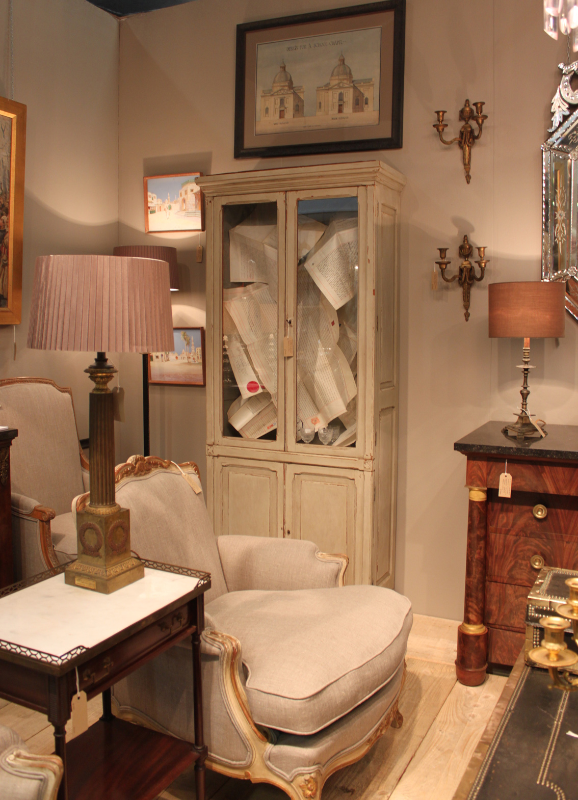
We had a difficult decision choosing just a few of our favourites, but take a look at some of our highlights and let us know what caught your eye!

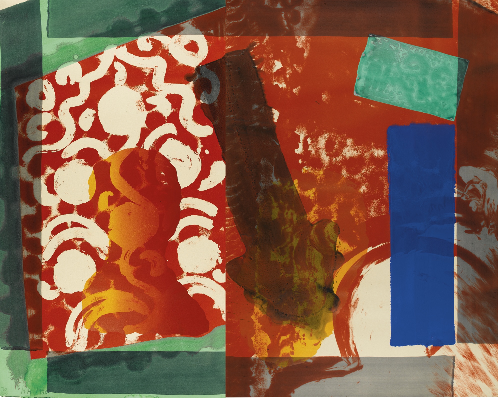
Howard Hodgkin’s work always catches our eye for its expressive colouring. The work below, entitled Moonlight (1980) is a beautiful lithograph printed in colours with additional hand-colouring. Hodgkin is one of Britain’s most important printmakers and painters and his bold style is completely captivating. Since the 1970s expressive patterning has dominated his work, combining printmaking techniques, bold brushstrokes and bright daubs of paint to produce punchy abstract works that would instantly enliven a room.

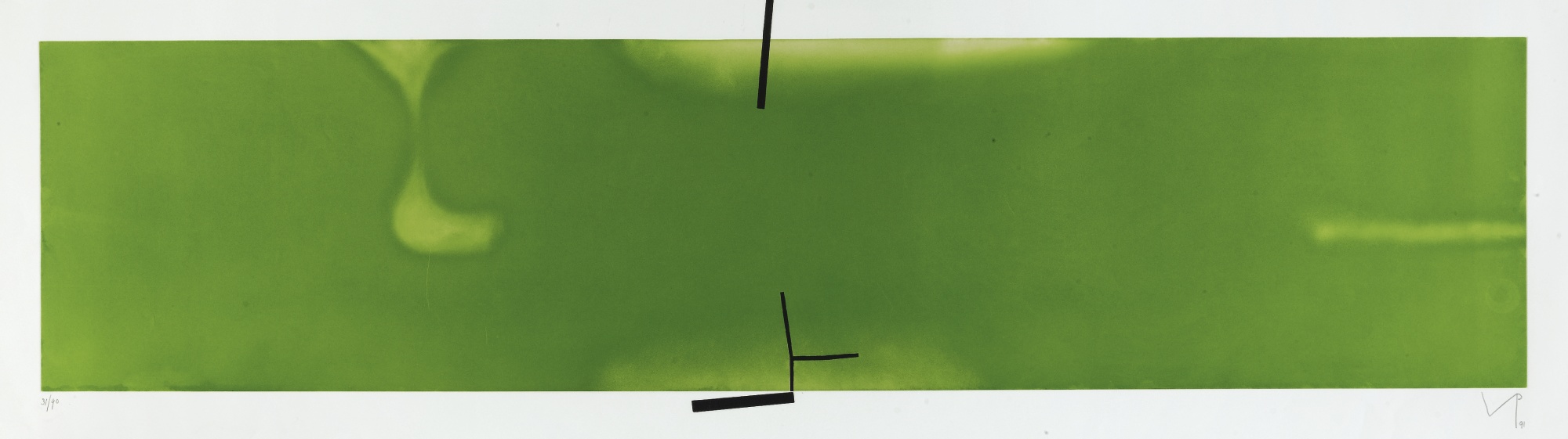
There is a finely balanced tension that we find interesting in Victor Pasmore’s work; the balance of saturated colour and fine black strikes. We were drawn to this piece entitled Senza Titolo (1991) for its unified hue. A work like this can really inform a colour scheme if you are designing a new interior, or help to tie together an existing colour scheme. We are inspired by works of art and their expressive colours and often use them as starting points for a new project’s colour scheme.

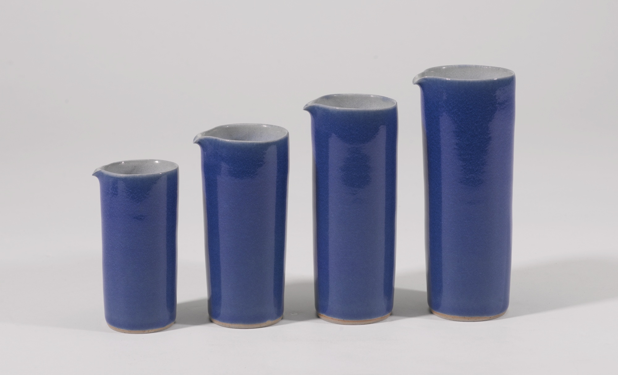
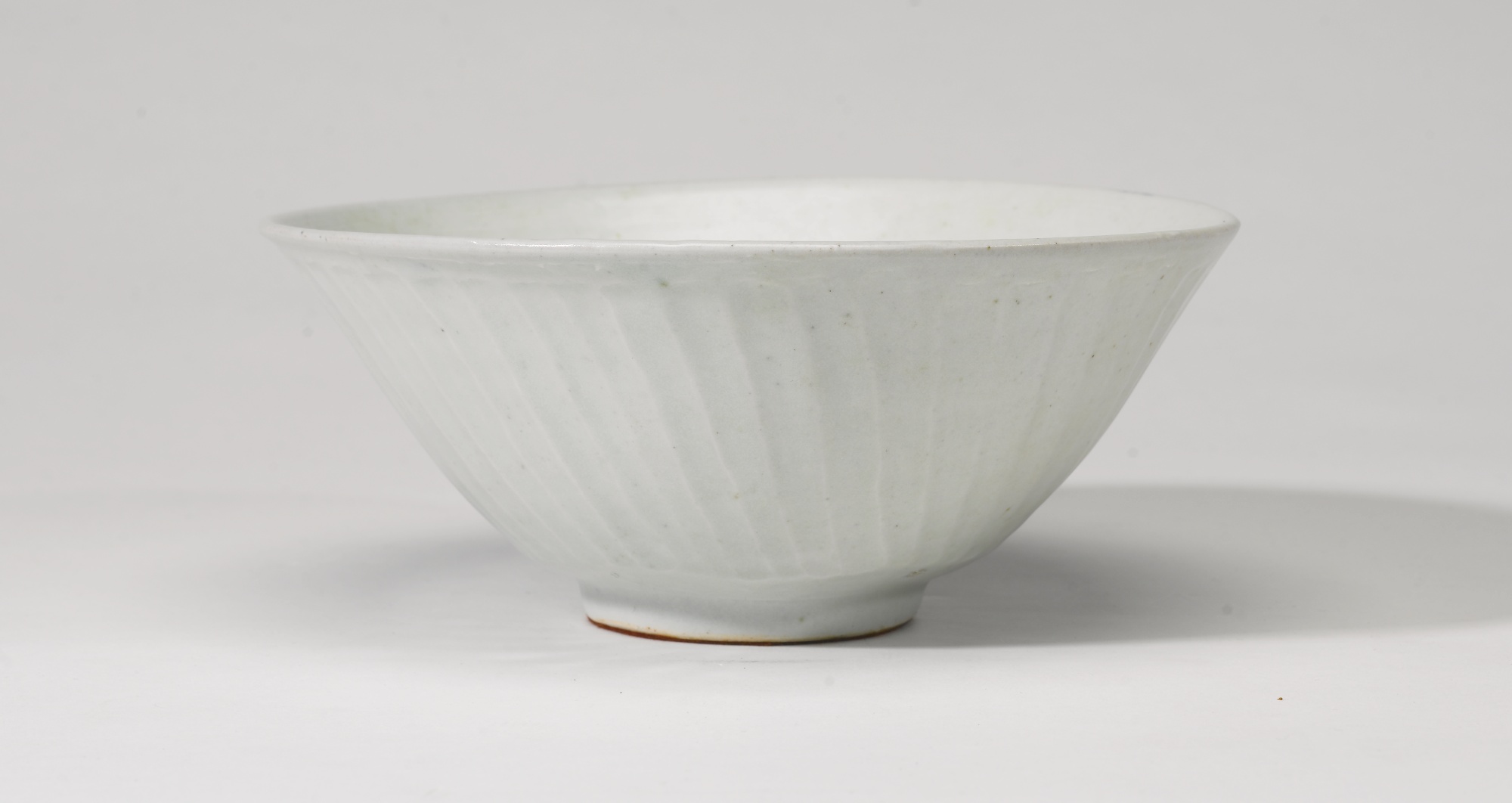
There was also a fantastic selection of ceramics on sale. The four pouring vessels by Rupert Spira, below left, are beautifully elegant in their shape and blue glaze. We were also drawn to the ceramic pieces on sale by Lucie Rie. The footed bowl, below centre, has a beautiful matt blue glaze and bronzed rim. On sale were also ceramics from one of Britain’s most respected and influential potters, Bernard Leach. The fluted bowl, below right, is made from porcelain with a celadon glaze. Its size, form and neutral glaze give it a sense of timeless elegance that would sit beautifully in either a modern or classic home.

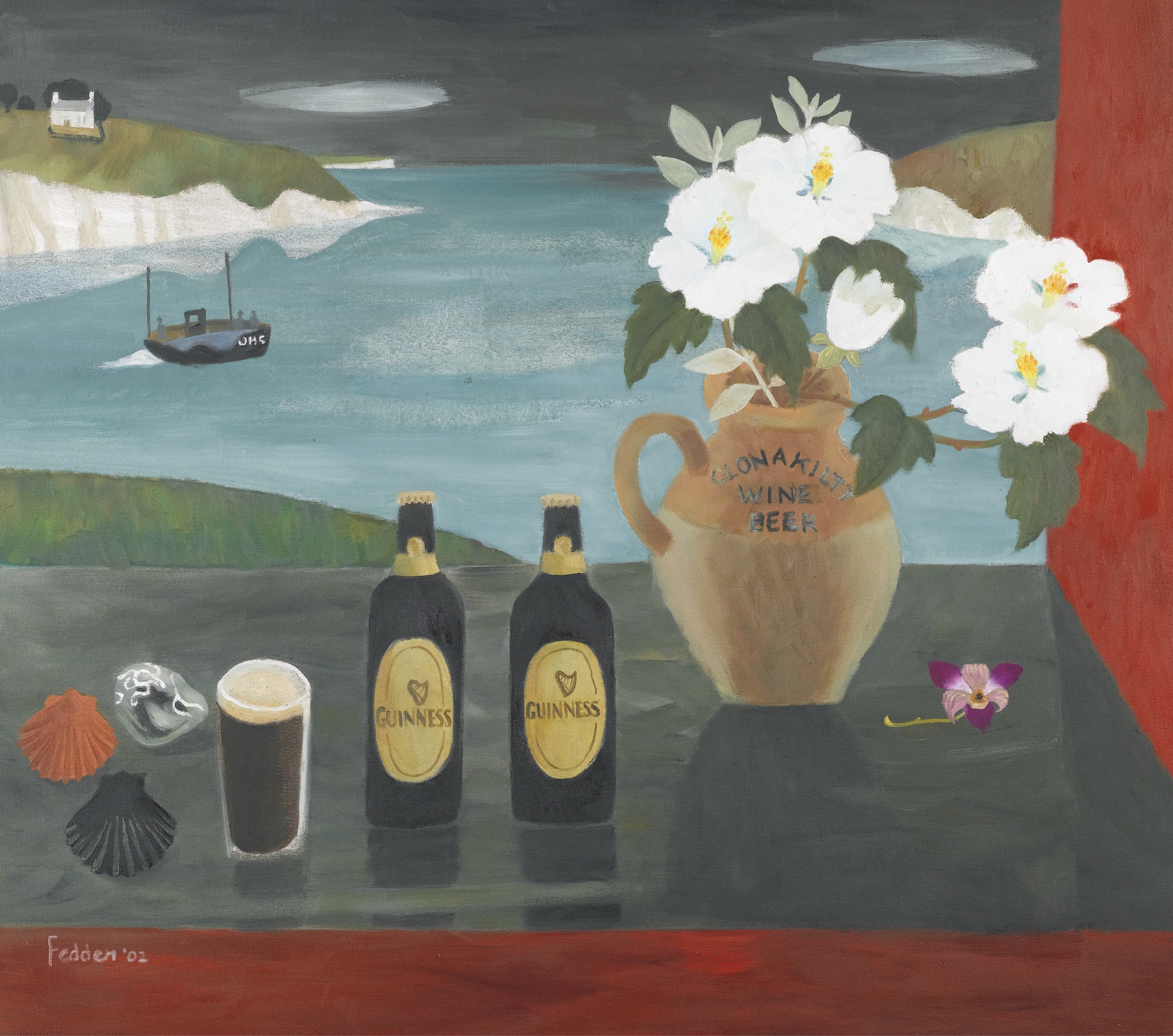
We were also struck by the painting on sale by Mary Fedden. Fedden’s work is characterised by her use of bold, often contrasting, expressive colours. The vivid colours in the painted still life, below, left, with reds, purples and greens would really bright a vibrant splash of colour to a neutral room. We often enjoy pairing vibrant works of art with interiors that have muted colour schemes, and tie it in with details like cushions that work with the colours.

With the Tate’s major retrospective on this month, we were also looking out for works by Barbara Hepworth. The lithograph printed in black and yellow, below left, is beautifully harmonious and would perfectly compliment an interior with a muted and subtle colour scheme. The screen print, below right, by Ben Nicholson has been printed on woven silk. The delicate quality of the material blends beautifully with his subtle and sensitive colour scheme. Whether your interior is modern or classic, works of art that are elegant and subtle like this piece can really add charm to your home.

Art Antiques London 2015 Fair

We visited Art Antiques London 2015. On display were some amazing pieces from artworks, ceramics and jewellery to rare books, textiles and furniture. We loved the variety of the exhibits as well as the insightful lecture programme with experts travelling to share their knowledge.

aal2013.jpg

As always though, we were drawn to some very specific pieces – here’s a selection of our favourite pieces from the fair.

We were really struck by this unique piece on display at Christopher Buck Antiques. This French walnut shell-shaped stool (c.1860) most likely served as a stool for a harp of cello. The piece features a carved shell shaped seat on a triple leg cariole stand.

We are always looking out for artworks that can be incorporated into our clients interiors. The Canon Gallery had a display of modern paintings and we loved this red chalk and pencil drawing by Sir Edward Burne-Jones. The drawing stood out for us as it is a study for Andromeda, a popular female subject for Burne-Jones.

Another art dealer that we are always keen to follow is Anthony Hepworth Fine Art, so we headed straight for their display. This piece by Colin Bishop (below left) for example could play into an interior with blue, grey and green hues. This work by renowned British artist Graham Sutherland (below right) takes a more figurative approach and could beautifully contribute to both a subdued interior and modern collection. They also had some works by Ivon Hitchens, a personal favourite of ours for his subtle tonality and colours.


Clerkenwell Design Week 2015 Showrooms

As well as the myriad of pop-up design stands and exhibits at Clerkenwell Design Week 2015, Clerkenwell is known for its impressive array of design showrooms. We visited a few of our favourites that were open during CDW.

West One Bathrooms always intrigues us for their display of both classic and often surprising bathroom designs. One of the ranges that caught our eye was the Vir Stil collection (below left) for Kallista designed by New York designer Laura Kirar. Kirar’s collection was inspired by different design periods including Danish Modern and traditional Japanese forms. From these inspirations she’s created an elegant collection that retains a classic sense of refinement together with subtle modern touches and materials. The console top comes in Calacatta Borghini marble with finishes in bronze, chrome or nickel. 

We also took a look at bulthaup’s showroom, which never fails to impress for its focus on perfect design and innovative kitchen solutions combined with a real sensitivity for the existing architecture of a building. We really liked the bulthaup b2 kitchen workshop (below) which really is designed to be functional and spatially economical.

We were also intrigued to see their arrangements of vintage tools and furnishings. In line with the young designers from our previous blog post, bulthaup also seems to be harking back and drawing influence from classic and older design sources.

Havwoods certainly went for a standout display method, their collection of exquisite wood floors was showcased atop an old fashioned Routemaster bus. Havwoods flooring can really transform a room, their exquisite quality and range of finishes would suit both a classic and modern interior.

The Decorative Antiques and Textiles Fair 2015

As well as incorporating existing collections to your interior, Devas Designs also specialises in sourcing and buying new items for clients. We source works of art, furniture and paintings that work for your space and tie in with your existing pieces helping you to create timeless and unique interiors.

We're lucky enough to have access to events and special previews of art exhibitions and auctions. The longstanding relationships we have with dealers who notify us of recent acquisitions means that we are able to view items items before most and respond quickly to dealer recommendations.

Last week we attended The Decorative Antiques and Textiles Fair in Battersea Park. On display were some real statement pieces from the 17th Century to 20th Century including furniture, lighting, mirrors and silver. Take a look at some of our favourite pieces from the fair.

This light (below left) from The Trading Room really was a standout centrepiece and caught our attention as soon as we arrived. Hilary Batstone's display featured elegant and chic pieces including both furniture and decorative items. The French Verdigris wall sconces (below right) had a timeless elegance that would suit both a modern and traditional interior.

Magus Antiques had an interesting display with pieces sourced from across Europe. We particularly liked the white painted French cabinet (below left) which comes as a pair, their purity and elegance gives them versatility. Another French pair caught our eye - these painted fauteuil chairs (below right) from Brownrigg. They have been recently upholstered in neutral fabric and together with their traditional style have a sense of classic gracefulness

Again French glamour captured our attention! This French mid 20th Century side Table (below left) on display from James Worrall looks elegant as a standalone piece.

Made In Britain at Sotheby's

March’s Made in Britain auction at Sotheby’s was a rather glamorous affair. Alongside artworks from renowned British artists from David Hockney to Tracey Emin, celebrity hangout The Ivy auctioned off its previous contents for charity. The Ivy is currently undergoing a complete contemporary makeover by Martin Brudnizki Design so its classic furnishings needed to find new homes. The items up for auction ranged from its iconic front doors, doormats and stained-glass windows to cloakroom tips trays, cocktail shakers and napkins.

Here are a few of our favourite pieces from the auction ...

Joe Tilson’s painting Dionysus, The Ivy and The Vine was commissioned for the restaurant in 1990. Having been a founding figure of British Pop art in the early 1960s, Tilson’s time in Italy and Greece in the 1970s-80s dramatically changed his style. He began focusing more on Classicism, taking inspiration from ancient mythology to develop his signature style. The bright colours of this painting hark back to his Pop style, while the work’s subject matter is based on Dionysus the Greek god of wine and festivity.

This unique intaglio print by Howard Hodgkin is stunningly rich in colour. It was based on a thick forest canopy and the artist worked over the intaglio print to achieve a richly layered effect.

Future System’s pair of champagne buckets on stands and designed to appear like oversize champagne glasses. Intriguingly, their otherworldly form was instructed by the optimum angle of the bottle lying in ice.

Some pieces from London based glass artist Anthony Stern were also up for auction. Stern was commissioned to make a collection of glasses for the restaurant. These coloured glasses were intended to echo the restaurant’s diamond shaped window panes.