Decorex 2016

Take a look at our ‘top 5’ highlights and designers from the fair ...
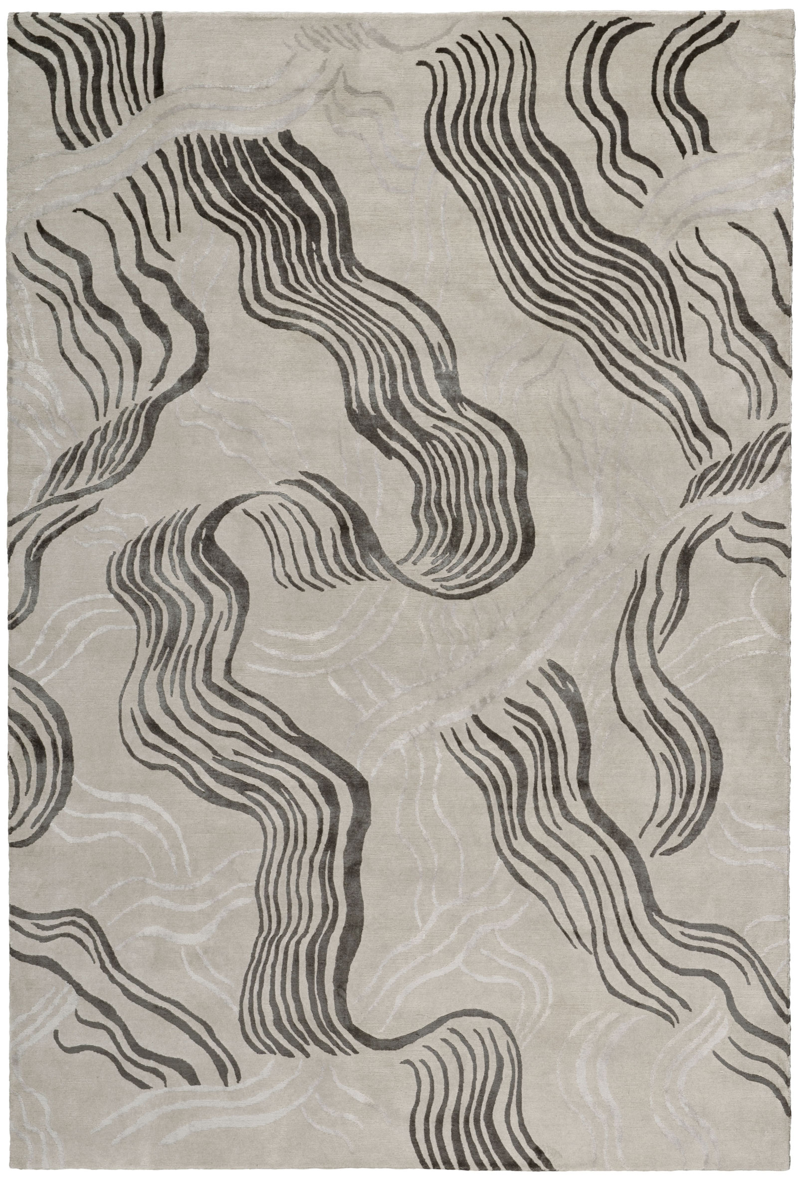
1/ PINCH

Since 2004 the Clapham-based husband and wife duo behind PINCH have been creating beautiful designs which have simplicity and purity at the heart of their form. They believe design can be poetic and being surrounded by beautiful things can be inspirational. It’s no surprise to hear their work has been nominated and won numerous design awards. We were excited to see their new collection, which launched at Decorex this week. The drinks cabinet and dresser particularly stood out. 

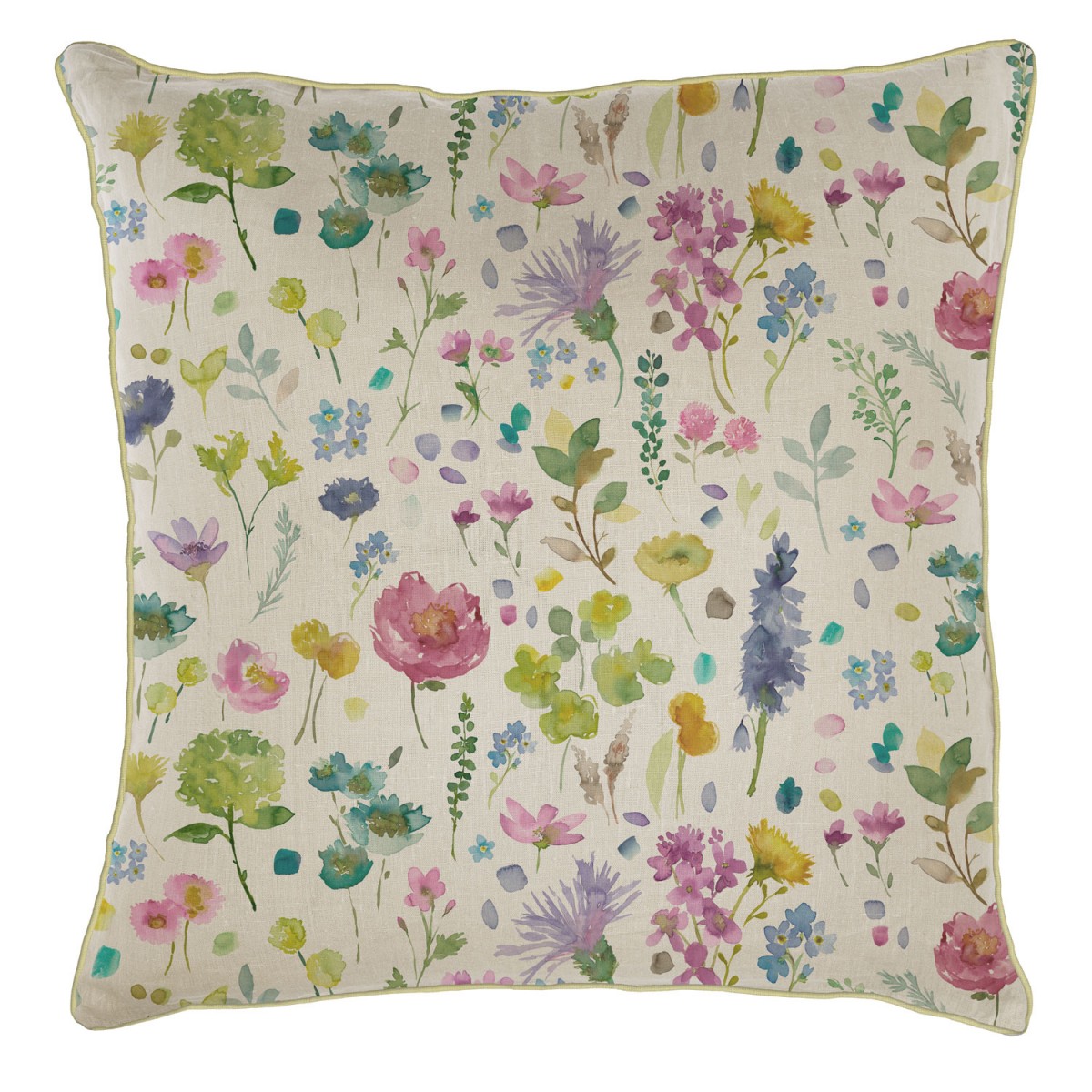
2/ Kew Home by Ivo Prints

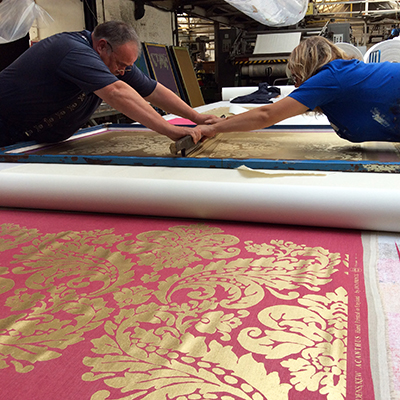
If you’ve been keeping up to date with our latest blog posts, you’ll notice that we’ve been very inspired by botanical designs recently, particularly the displays at Kew Gardens. We were delighted to see Ivo Designs showcasing their Kew Textile range. Every design and pattern is based on original references from the library and archives at the Botanical Gardens in Kew. Each design is hand silk screen printed using traditional processes - a labour intensive process they admit! Their emphasis on craft and process ties in perfectly with Decorex’s theme this year.
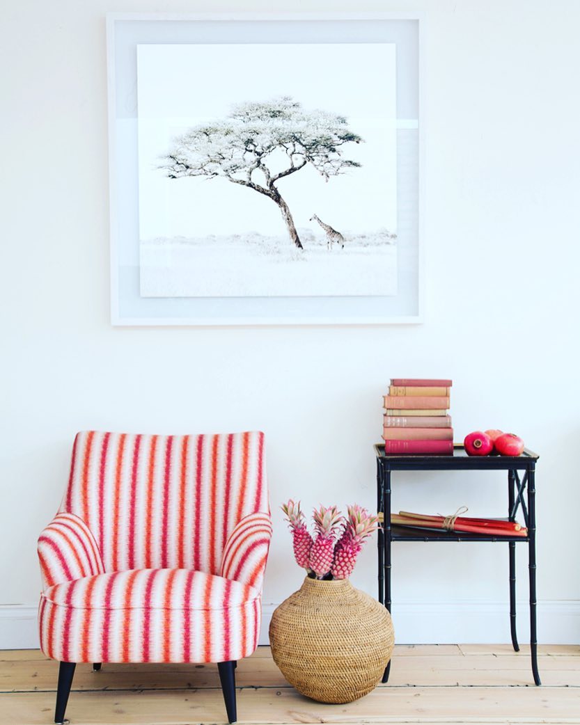
3/ Lumitrix

Our next addition is an unusual choice for Decorex; Lumitrix aren't designers but instead curators of photographic works. They represent a gallery of images from over 20 photographers from around the world. What we love about their ethos is their dedication to represent young talent alongside established names. Every photograph is available in four different sizing options and varying hand-painted frames, so your print can be tailored to your interior and space. We source works of art for clients and appreciate the attention given to each carefully selected image. Lumitrix is a great company to use if you’re looking to add some character and edge to your home but find the selection process challenging. A highlight for us is their range by Astrid Harrisson who photographed wild horses at dawn in the South of France (pictured above).

4/ William Holland

William Holland specialise in copper baths and basins - their dedication has paid off as they're considered the world's leading specialist manufacturer in their trade. A free standing baths would look wonderfully elegant in a country bathroom or add some warmth and luxury to a city space. The factory is based in a 17th-century Tithe barn in the Dorset countryside and we're sure this peaceful location is embedded within their product's experience. We also loved their display of miniatures to show examples of every finish. 

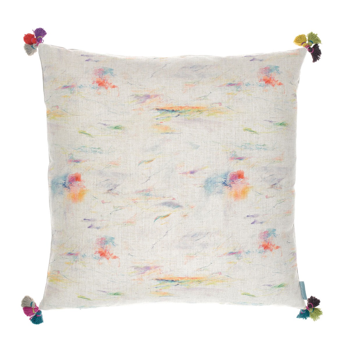
5/ Susie Watson Designs

Our favourite moments at Decorex are when we discover a new designer and Susie Watson's work really caught our eye. Her passion for colour and design shines through and we love her soft blends of colour. Her pastel pinks and blues would look lovely in a country cottage, particularly for a child's bedroom if you want a soft, subtle and calming atmosphere.

Painterly Interiors

Following last week's blog about the inspirational work of Etel Adnan currently on display at London’s Serpentine Sackler Gallery and her painterly tapestries, we sought out some bright designers who are creating painterly furnishings and objects for the home. These items are perfect pieces to add artistic charm to your home and lovely additions to an art-lovers room! We'll often take inspiration from works of art for our interior design projects and love the idea of introducing painted ceramics, rug designs based on paintings and art-inspired furnishings.

First up … Aino-Maija Metsola is an illustrator and print designer from Finland. She works as an in-house designer for print powerhouse Marimekko, designing prints for clothing and interior textiles. Metsola also created the ‘Weather Diary’ prints for their plates, tea bowls and cups. We love this collection as it was inspired by natural elements; the Finnish weather and shoreline. Metsola drew the designs in watercolour and ink, focussing on rain, clouds and grass fields. These bowls and cups would look lovely set against crisp, white linen and fresh cut white flowers, to create an elegant and charming table.

The collection is available to buy from a number of UK stores including Heal’s.

Kelly Wearstler’s collection for The Rug Company is another beautiful collaboration. Her hand-painted designs have been crafted into a series of rugs, each handmade by skilful specialist weavers in the Kathmandu area. ‘Wake’ shown below left draws inspiration from the free and fluid movements of water, creating an elegant and subtle design which would look lovely in a contemporary setting with a subtle colour scheme. Wearstler’s ‘Graffito’ design on the right is inspired by her love of graffiti and street art. The combination of a painterly, raw brush stroke design and pale blue colouring create a beautiful balance.

Wearstler's design below, named 'Flaunt' also draws on the fluid movements of water and includes bursts of sheeny blue to enliven the rug's surface.

London based, Australian designer Amy Sia creates beautiful hand-painted designs for textiles and clothing. For Amy, accessories act as a canvas, and and each design is an artwork. Her passion for colour is evident in her bright textiles, their boldness is offset with her sensitively drawn designs - Sia's floral-like patterns particularly caught our eye. Like Metsola, Amy Sia’s designs are first drawn in watercolour and then transferred digitally onto handmade cushions, seen below.

Visit Amy Sia's website to see more.

Inspired by Chelsea in Bloom!

Last week Chelsea was in full bloom! Alongside the RHS Chelsea Flower Show were the annual local displays of floral creations from Chelsea retailers who compete for a winning display.

We loved these displayed by Hackett and Links below. This year’s theme was ‘Carnival’ inspired by the Rio de Janeiro Carnival and Hackett embraced tropical flowers and colours, while Links opted to fly the British flag.

The White Company's window was our favourite, it's elephant creation was made by Larry Walshe.

Fancy a beautiful flower display without the hassle of watering? We also love these faux flowers from Oka which look remarkably realistic, they also mean you aren't guided by the season and can chose exotic displays all year round. Oka recommend starting each arrangement with three flowers, building up by three each time until your display looks full enough. For a more realistic display chose a variety of sizes and shapes; include full flowers with an abundance of petals as well as greenery and branches like the display below on the right.

We've said it before, but we stand by the simple fact that changing cushions, linen, throws and small accessories is the easiest way to quickly transform a room. If you're looking for some temporary colour and pattern we love these floral-inspired cushions from bluebellgray. We love their signature painterly style and each cushion is painted and sewn by hand in bluebellgray's Glasgow studio, making them truly unique.

Matisse: Drawing with Scissors

Today’s blog is inspired by the work of Matisse and the touring exhibition ‘Matisse: Drawing with Scissors’ which is currently on display at the London Print Studio until June 11th.

The exhibition lithographic showcases prints of Matisse’s famous cut-outs which he produced in the last years of his life. He produced these works in his eighties, using paper that had been hand-painted with gouache, cut out then laid back down in abstract or figurative patterns. Matisse said ‘the paper cut-out allows me to draw in the colour… Instead of drawing the outline and putting the colour inside it… I draw straight into the colour’.

We also loved these images of Matisse’s studio in Nice c. 1952 and have been inspired by his bright and bold colours.

The exhibition is well worth a visit and we were inspired by the colours we saw to source a few items inspired by Matisse. Take a look at our picks below to find out how you can introduce some colour into your home, subtly, for the Summer months.

We found this beautiful removable wallpaper on Etsy by Kate Zaremba Company. Designer Kate Zaremba works as an illustrator and surface designer in Washington, she’s inspired by her childhood career in film and theatre as well as her trips to art galleries. We love the sense of play and creative imagination in her designs that comes from these influences. Take a look at the wallpapers below which have been inspired by Matisse’s cut-outs. Her wallpapers are self-adhesive, so easy to apply and remove. This is great if you’re looking to add some Summer colour and brighten up a room temporarily! 

The cushion below comes from Coverture & The Garbstore, who have a lovely shop in Notting Hill. They chose not to stock big brands and instead focus on independent and unique labels. This cotton cushion with a Matisse inspired print is designer by Bobo Choses and would add instant creative colour to your sofa or bed. They’ve also designed this fun beach towel, shown bottom right, if you fancy taking something colourful on your travels this Summer!

Fabric Inspiration

For this week’s blog we want to focus on fabrics.

When we work on an interior design project, we often make use of beautifully printed or painted fabrics. Whether you are choosing fabrics for furniture and small furnishings or larger wall coverings, it is crucial that the colour and design tie in with the look and feel of your interior - if you’re completely drawn to a fabric it can even inspire your overall colour scheme.

Elizabeth Eakins set up her rug and textile business in 1978, with a focus on making by hand. All of her fabrics are made from natural fibers and include linen, hemp and wool blends. We were particularly drawn to this natural hemp linen fabric, ‘Esther Young’ in azure and rose.

We also loved this fabric from Harlequin’s collection. The fabric has been digitally printed for accuracy with botanical-style representations of hummingbirds in beautiful and crisp colours. The detail is exquisite and would add both a splash of colour and a real sense character to either a classic or contemporary interior.

Turnell and Gigon distribute beautiful fabrics which range from both classic and contemporary designs. We loved these deigns in cream and blue colours, the coloured detail looks beautiful over these subtle backgrounds. 

'Made in Britain' // Sotheby's

We had a difficult decision choosing just a few of our favourites, but take a look at some of our highlights and let us know what caught your eye!

Howard Hodgkin’s work always catches our eye for its expressive colouring. The work below, entitled Moonlight (1980) is a beautiful lithograph printed in colours with additional hand-colouring. Hodgkin is one of Britain’s most important printmakers and painters and his bold style is completely captivating. Since the 1970s expressive patterning has dominated his work, combining printmaking techniques, bold brushstrokes and bright daubs of paint to produce punchy abstract works that would instantly enliven a room.

There is a finely balanced tension that we find interesting in Victor Pasmore’s work; the balance of saturated colour and fine black strikes. We were drawn to this piece entitled Senza Titolo (1991) for its unified hue. A work like this can really inform a colour scheme if you are designing a new interior, or help to tie together an existing colour scheme. We are inspired by works of art and their expressive colours and often use them as starting points for a new project’s colour scheme.

There was also a fantastic selection of ceramics on sale. The four pouring vessels by Rupert Spira, below left, are beautifully elegant in their shape and blue glaze. We were also drawn to the ceramic pieces on sale by Lucie Rie. The footed bowl, below centre, has a beautiful matt blue glaze and bronzed rim. On sale were also ceramics from one of Britain’s most respected and influential potters, Bernard Leach. The fluted bowl, below right, is made from porcelain with a celadon glaze. Its size, form and neutral glaze give it a sense of timeless elegance that would sit beautifully in either a modern or classic home.

We were also struck by the painting on sale by Mary Fedden. Fedden’s work is characterised by her use of bold, often contrasting, expressive colours. The vivid colours in the painted still life, below, left, with reds, purples and greens would really bright a vibrant splash of colour to a neutral room. We often enjoy pairing vibrant works of art with interiors that have muted colour schemes, and tie it in with details like cushions that work with the colours.

With the Tate’s major retrospective on this month, we were also looking out for works by Barbara Hepworth. The lithograph printed in black and yellow, below left, is beautifully harmonious and would perfectly compliment an interior with a muted and subtle colour scheme. The screen print, below right, by Ben Nicholson has been printed on woven silk. The delicate quality of the material blends beautifully with his subtle and sensitive colour scheme. Whether your interior is modern or classic, works of art that are elegant and subtle like this piece can really add charm to your home.

Christie's Interiors August 2015

Christie’s South Kensington is celebrating its 40th year with talks and events. This week we attended the Christie’s Interiors August auction and a talk on The Art of Interior Design with some great speakers including James McWhirter and Sarah Morris of McWhirter Morris.

We visit as many art, antiques and designs fairs as we can and are always on the lookout for unique pieces. Here are some of our favourite pieces from Christie’s Interiors August auction – the auction is on August 18th so do pop along to take a look at what’s on sale.

Alongside items of furniture are a stunning selection of 20th and 21st Century paintings. The work of Polish painter Zdzislaw Ruszkowski (1907-1991) particularly caught our eye. During the 1930s Ruszowski moved to France where he discovered the work of Cezanne and was hugely inspired by his colouring and Post-Impressionistic approach. There is a beautiful and sensitive lyricism in Ruszowski’s work, aided by his playful yet harmonious colour schemes.

We were also intrigued by these coloured chalk drawings by John Golding. The colour scheme, with subtle hints and richer tones could provide the perfect inspiration for an interior’s colour scheme. This is a great example of how one piece, like a work of art, can really influence and dictate your interior design choices.


Clerkenwell Design Week 2015 Showrooms

As well as the myriad of pop-up design stands and exhibits at Clerkenwell Design Week 2015, Clerkenwell is known for its impressive array of design showrooms. We visited a few of our favourites that were open during CDW.

West One Bathrooms always intrigues us for their display of both classic and often surprising bathroom designs. One of the ranges that caught our eye was the Vir Stil collection (below left) for Kallista designed by New York designer Laura Kirar. Kirar’s collection was inspired by different design periods including Danish Modern and traditional Japanese forms. From these inspirations she’s created an elegant collection that retains a classic sense of refinement together with subtle modern touches and materials. The console top comes in Calacatta Borghini marble with finishes in bronze, chrome or nickel. 

We also took a look at bulthaup’s showroom, which never fails to impress for its focus on perfect design and innovative kitchen solutions combined with a real sensitivity for the existing architecture of a building. We really liked the bulthaup b2 kitchen workshop (below) which really is designed to be functional and spatially economical.

We were also intrigued to see their arrangements of vintage tools and furnishings. In line with the young designers from our previous blog post, bulthaup also seems to be harking back and drawing influence from classic and older design sources.

Havwoods certainly went for a standout display method, their collection of exquisite wood floors was showcased atop an old fashioned Routemaster bus. Havwoods flooring can really transform a room, their exquisite quality and range of finishes would suit both a classic and modern interior.

Clerkenwell Design Week 2015

Clerkenwell Design Week was a truly inspirational festival, a real celebration of craft and design. CDW2015 showcased both established and emerging designers and companies. There was a really refreshing variety of work, but what we were most struck by was the shared sense of nostalgia. There seemed to be a focus on looking back to historic design movements for inspiration as well as keeping craft alive.

This Robin Day chair (below left) caught our eye as soon as we walked in. Day undoubtedly transformed British design and high street furniture, his 'Polyprop' stacking chairs has become one of the best selling chairs of all time. It was his postwar modernist furniture though that has been so influential to contemporary design as he developed low-cost but sensitively designed items.

His influence was evident in Stellar Works 'Utility' range (below right) which centres on this idea of function and efficiency. Their return to industrial design is counterbalanced by their use of soft leather and smooth woods.

Stellar Works Laval desk (below left) is a collaboration between French furniture maker Laval and Danish design studio OeO. The collection aims to merge a sense of French elegance and simplicity with a more modern need for comfort and utility.

Tomas Alonso’s Offset Table (below right) designed for Maxdesign responds to the need for flexibility in modern working home offices. The table can be broken down and customized for varying lighting, cable and size requirements. Alonso describes it as ‘a place to eat, a place to work and a place to meet all at the same table’.

It was great to meet the team at James UK as we really value their emphasis on British craft. All of their furniture is made in the UK by a team of skilled carpenters and upholsterers. The Norton Cove sofa (below left) is a larger take on the typical armchair.

Furniture brand H were inspired by a belt-making loom found in Oaxaca, Mexico for their Loom chair (below right). They've been collaborating with a textile designer whose colour choices perfectly balance with the hardwood frame.

Thonet's iconic range has been updated to suit contemporary interiors. Their display focussed on their design history showing the evolution of Thonet’s curved wooden designs to Marcel Breuer’s curved tubular steel designs.