Fabric Inspiration

For this week’s blog we want to focus on fabrics.

When we work on an interior design project, we often make use of beautifully printed or painted fabrics. Whether you are choosing fabrics for furniture and small furnishings or larger wall coverings, it is crucial that the colour and design tie in with the look and feel of your interior - if you’re completely drawn to a fabric it can even inspire your overall colour scheme.

Elizabeth Eakins set up her rug and textile business in 1978, with a focus on making by hand. All of her fabrics are made from natural fibers and include linen, hemp and wool blends. We were particularly drawn to this natural hemp linen fabric, ‘Esther Young’ in azure and rose.

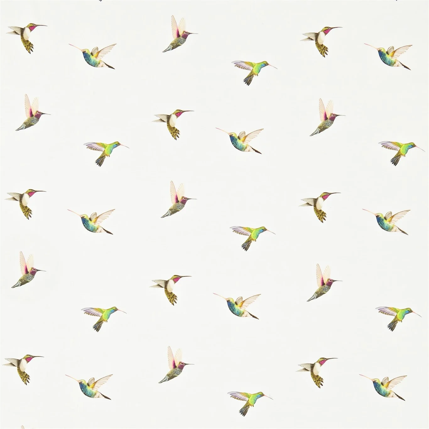
We also loved this fabric from Harlequin’s collection. The fabric has been digitally printed for accuracy with botanical-style representations of hummingbirds in beautiful and crisp colours. The detail is exquisite and would add both a splash of colour and a real sense character to either a classic or contemporary interior.

Turnell and Gigon distribute beautiful fabrics which range from both classic and contemporary designs. We loved these deigns in cream and blue colours, the coloured detail looks beautiful over these subtle backgrounds. 

'Made in Britain' // Sotheby's

We had a difficult decision choosing just a few of our favourites, but take a look at some of our highlights and let us know what caught your eye!

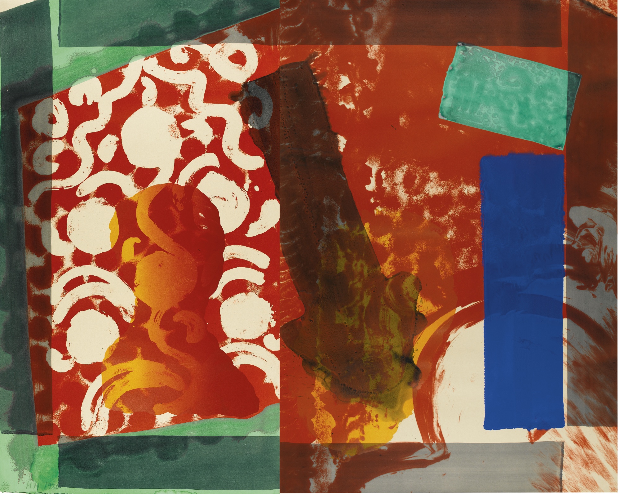
Howard Hodgkin’s work always catches our eye for its expressive colouring. The work below, entitled Moonlight (1980) is a beautiful lithograph printed in colours with additional hand-colouring. Hodgkin is one of Britain’s most important printmakers and painters and his bold style is completely captivating. Since the 1970s expressive patterning has dominated his work, combining printmaking techniques, bold brushstrokes and bright daubs of paint to produce punchy abstract works that would instantly enliven a room.

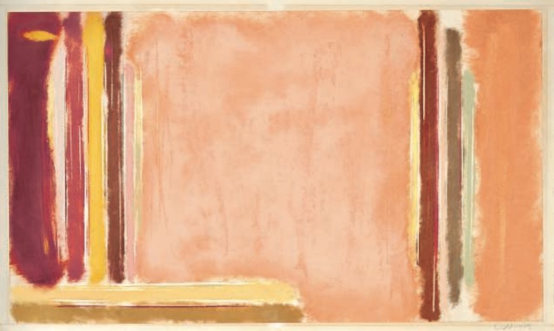
There is a finely balanced tension that we find interesting in Victor Pasmore’s work; the balance of saturated colour and fine black strikes. We were drawn to this piece entitled Senza Titolo (1991) for its unified hue. A work like this can really inform a colour scheme if you are designing a new interior, or help to tie together an existing colour scheme. We are inspired by works of art and their expressive colours and often use them as starting points for a new project’s colour scheme.

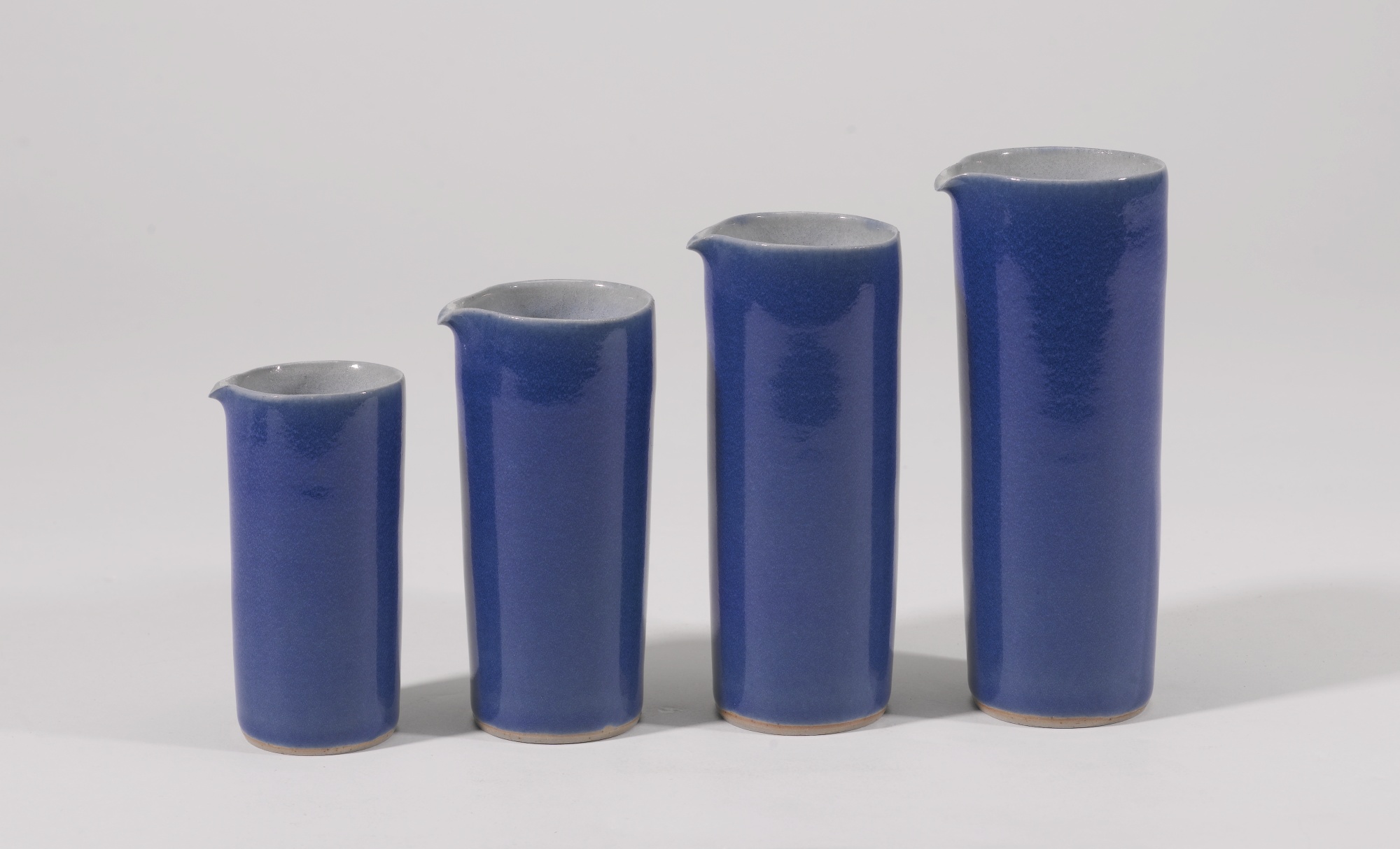
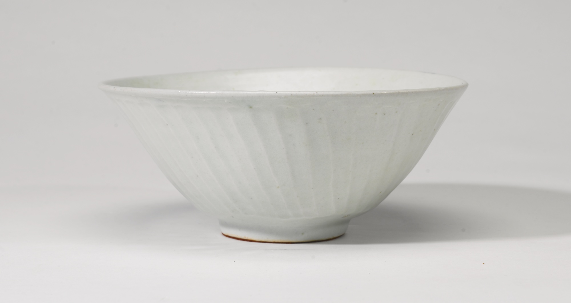
There was also a fantastic selection of ceramics on sale. The four pouring vessels by Rupert Spira, below left, are beautifully elegant in their shape and blue glaze. We were also drawn to the ceramic pieces on sale by Lucie Rie. The footed bowl, below centre, has a beautiful matt blue glaze and bronzed rim. On sale were also ceramics from one of Britain’s most respected and influential potters, Bernard Leach. The fluted bowl, below right, is made from porcelain with a celadon glaze. Its size, form and neutral glaze give it a sense of timeless elegance that would sit beautifully in either a modern or classic home.

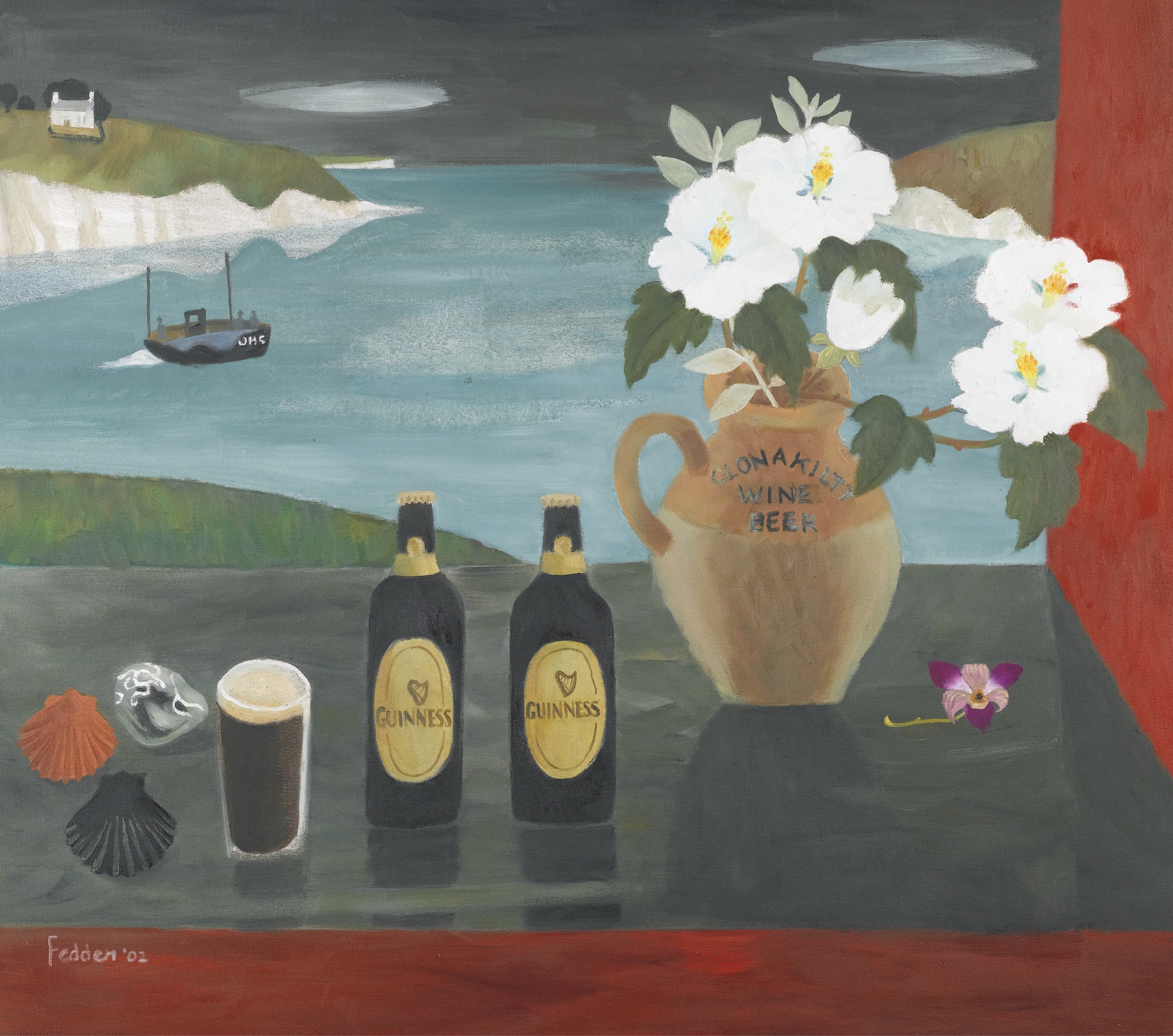
We were also struck by the painting on sale by Mary Fedden. Fedden’s work is characterised by her use of bold, often contrasting, expressive colours. The vivid colours in the painted still life, below, left, with reds, purples and greens would really bright a vibrant splash of colour to a neutral room. We often enjoy pairing vibrant works of art with interiors that have muted colour schemes, and tie it in with details like cushions that work with the colours.

With the Tate’s major retrospective on this month, we were also looking out for works by Barbara Hepworth. The lithograph printed in black and yellow, below left, is beautifully harmonious and would perfectly compliment an interior with a muted and subtle colour scheme. The screen print, below right, by Ben Nicholson has been printed on woven silk. The delicate quality of the material blends beautifully with his subtle and sensitive colour scheme. Whether your interior is modern or classic, works of art that are elegant and subtle like this piece can really add charm to your home.

Christie's Interiors August 2015

Christie’s South Kensington is celebrating its 40th year with talks and events. This week we attended the Christie’s Interiors August auction and a talk on The Art of Interior Design with some great speakers including James McWhirter and Sarah Morris of McWhirter Morris.

We visit as many art, antiques and designs fairs as we can and are always on the lookout for unique pieces. Here are some of our favourite pieces from Christie’s Interiors August auction – the auction is on August 18th so do pop along to take a look at what’s on sale.

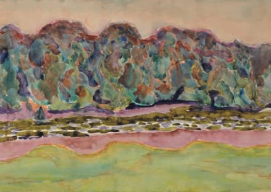
Alongside items of furniture are a stunning selection of 20th and 21st Century paintings. The work of Polish painter Zdzislaw Ruszkowski (1907-1991) particularly caught our eye. During the 1930s Ruszowski moved to France where he discovered the work of Cezanne and was hugely inspired by his colouring and Post-Impressionistic approach. There is a beautiful and sensitive lyricism in Ruszowski’s work, aided by his playful yet harmonious colour schemes.

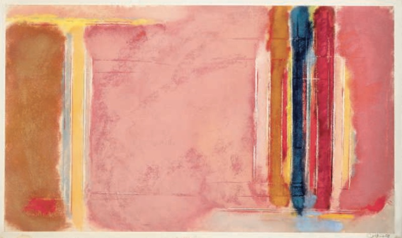
We were also intrigued by these coloured chalk drawings by John Golding. The colour scheme, with subtle hints and richer tones could provide the perfect inspiration for an interior’s colour scheme. This is a great example of how one piece, like a work of art, can really influence and dictate your interior design choices.


Clerkenwell Design Week 2015 Showrooms

As well as the myriad of pop-up design stands and exhibits at Clerkenwell Design Week 2015, Clerkenwell is known for its impressive array of design showrooms. We visited a few of our favourites that were open during CDW.

West One Bathrooms always intrigues us for their display of both classic and often surprising bathroom designs. One of the ranges that caught our eye was the Vir Stil collection (below left) for Kallista designed by New York designer Laura Kirar. Kirar’s collection was inspired by different design periods including Danish Modern and traditional Japanese forms. From these inspirations she’s created an elegant collection that retains a classic sense of refinement together with subtle modern touches and materials. The console top comes in Calacatta Borghini marble with finishes in bronze, chrome or nickel. 

We also took a look at bulthaup’s showroom, which never fails to impress for its focus on perfect design and innovative kitchen solutions combined with a real sensitivity for the existing architecture of a building. We really liked the bulthaup b2 kitchen workshop (below) which really is designed to be functional and spatially economical.

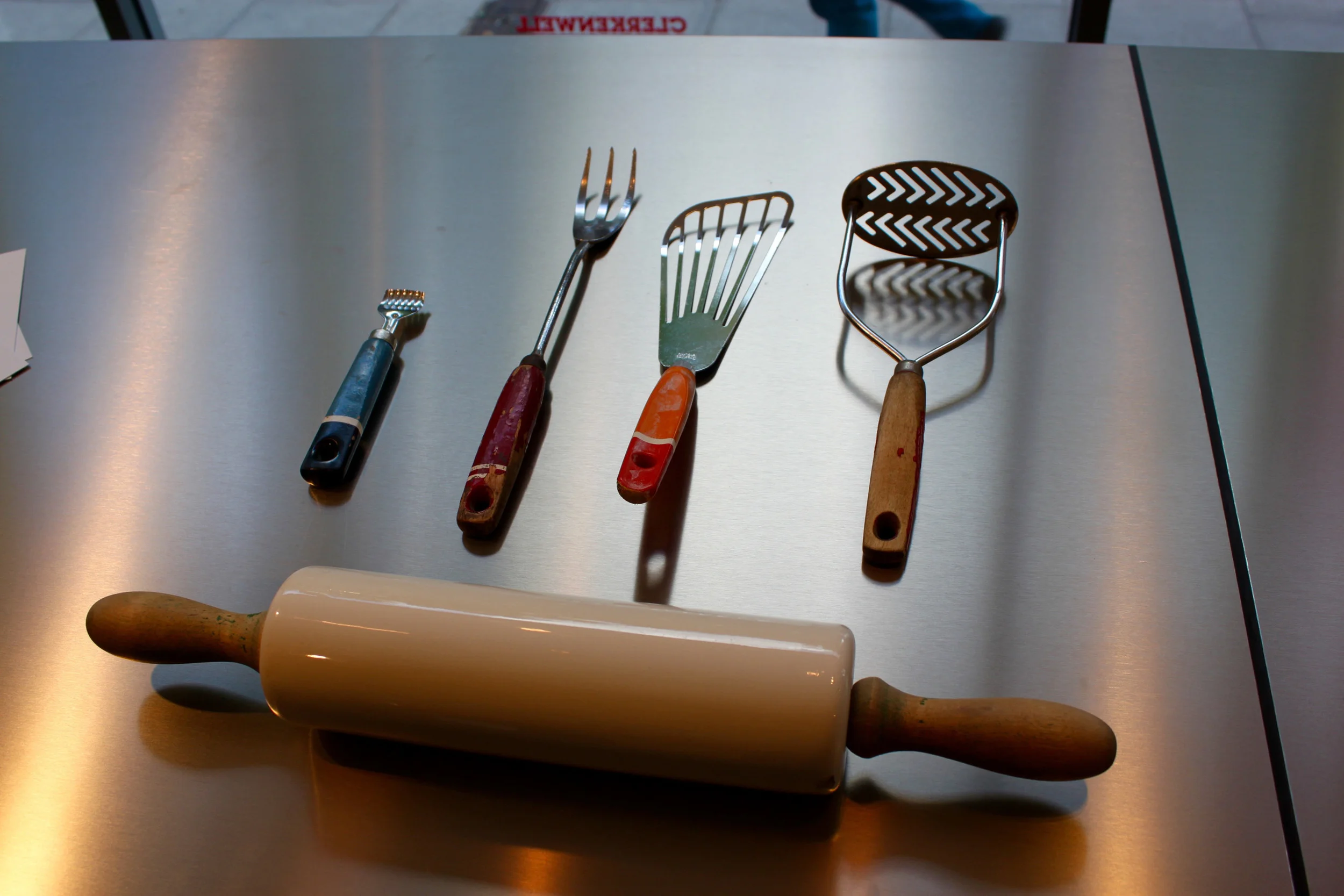
We were also intrigued to see their arrangements of vintage tools and furnishings. In line with the young designers from our previous blog post, bulthaup also seems to be harking back and drawing influence from classic and older design sources.

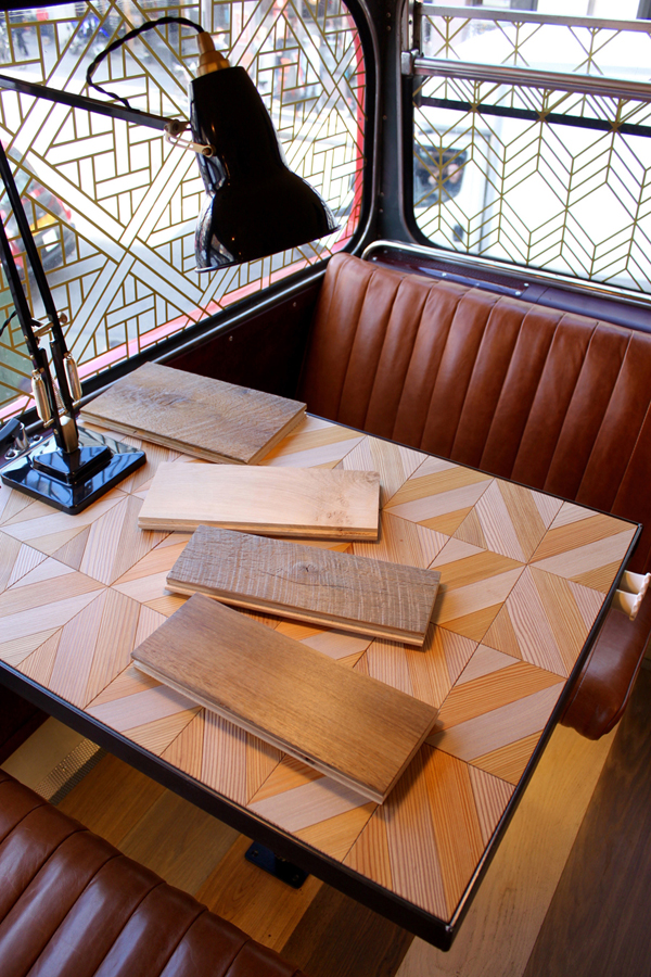
Havwoods certainly went for a standout display method, their collection of exquisite wood floors was showcased atop an old fashioned Routemaster bus. Havwoods flooring can really transform a room, their exquisite quality and range of finishes would suit both a classic and modern interior.

Clerkenwell Design Week 2015

Clerkenwell Design Week was a truly inspirational festival, a real celebration of craft and design. CDW2015 showcased both established and emerging designers and companies. There was a really refreshing variety of work, but what we were most struck by was the shared sense of nostalgia. There seemed to be a focus on looking back to historic design movements for inspiration as well as keeping craft alive.

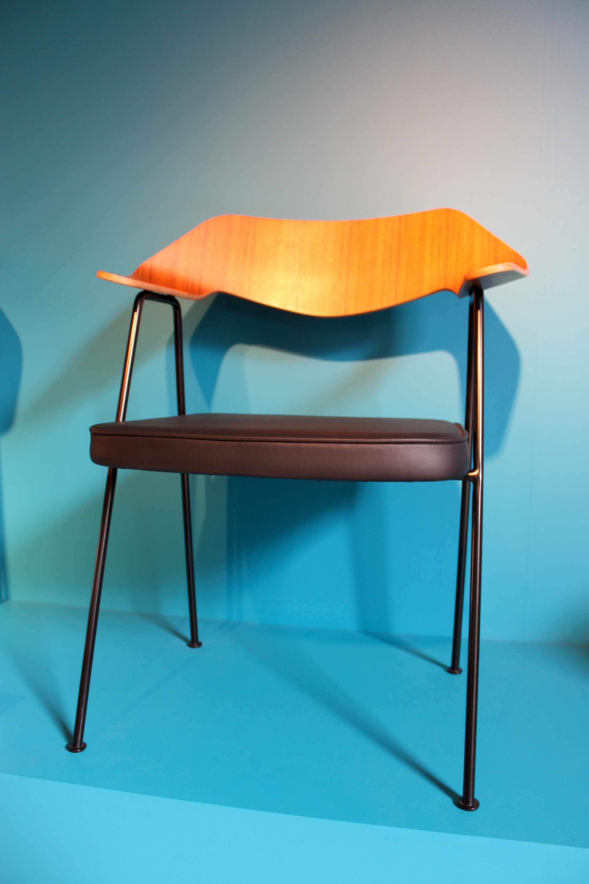
This Robin Day chair (below left) caught our eye as soon as we walked in. Day undoubtedly transformed British design and high street furniture, his 'Polyprop' stacking chairs has become one of the best selling chairs of all time. It was his postwar modernist furniture though that has been so influential to contemporary design as he developed low-cost but sensitively designed items.

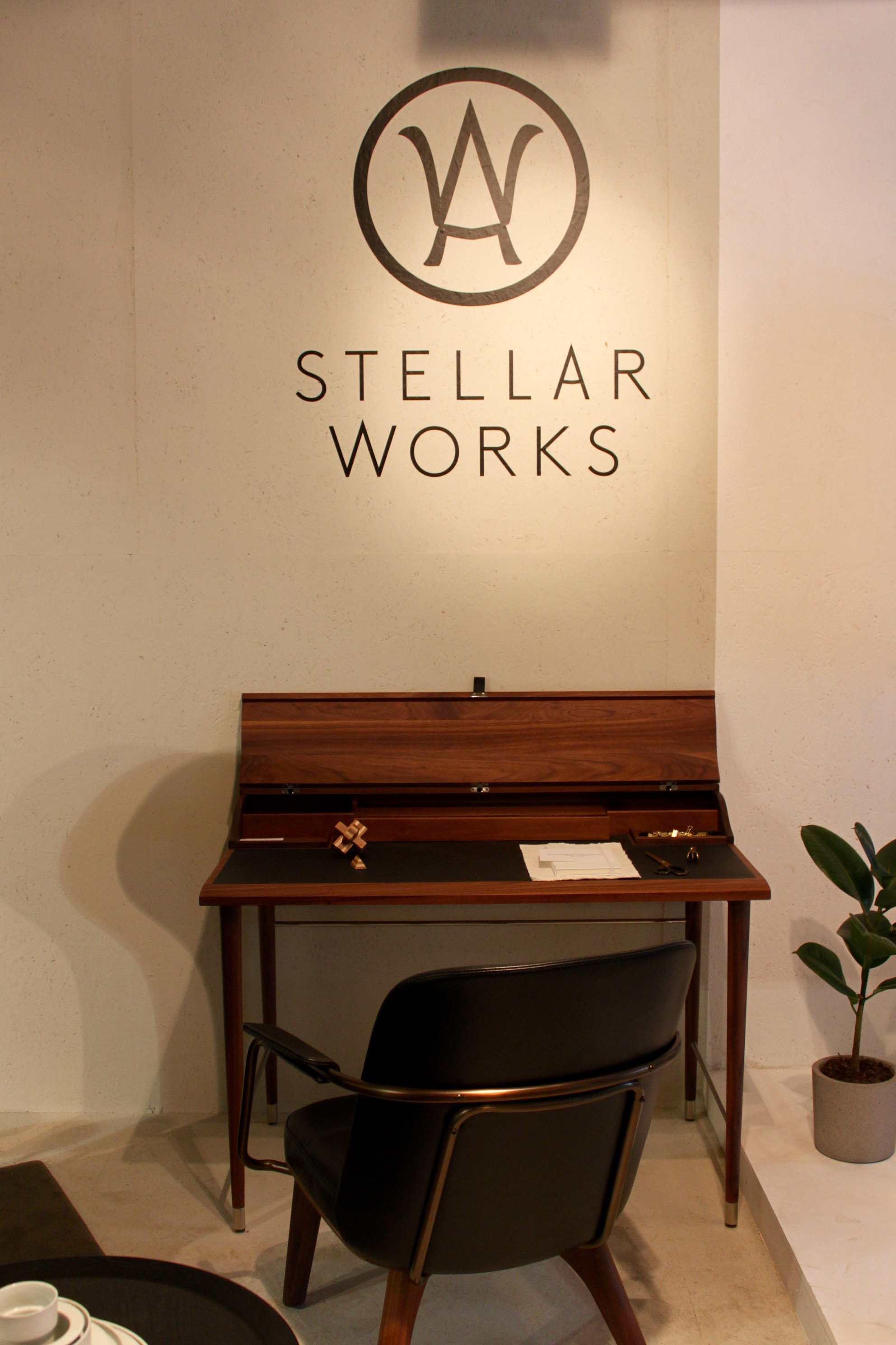
His influence was evident in Stellar Works 'Utility' range (below right) which centres on this idea of function and efficiency. Their return to industrial design is counterbalanced by their use of soft leather and smooth woods.

Stellar Works Laval desk (below left) is a collaboration between French furniture maker Laval and Danish design studio OeO. The collection aims to merge a sense of French elegance and simplicity with a more modern need for comfort and utility.

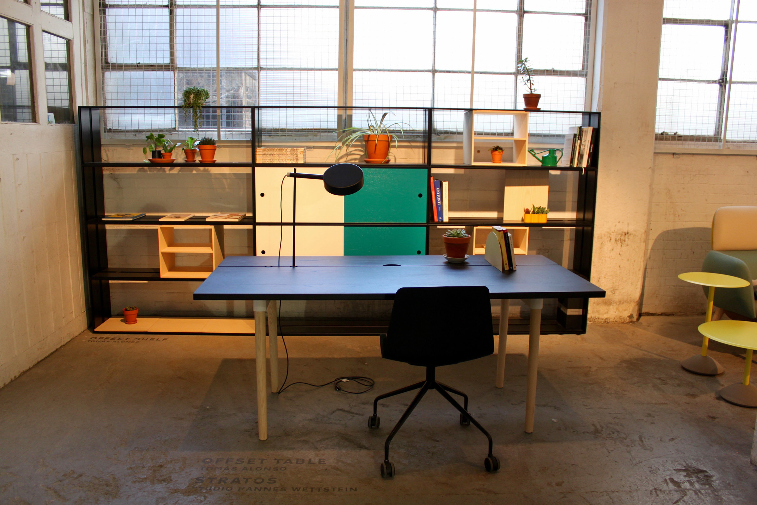
Tomas Alonso’s Offset Table (below right) designed for Maxdesign responds to the need for flexibility in modern working home offices. The table can be broken down and customized for varying lighting, cable and size requirements. Alonso describes it as ‘a place to eat, a place to work and a place to meet all at the same table’.

It was great to meet the team at James UK as we really value their emphasis on British craft. All of their furniture is made in the UK by a team of skilled carpenters and upholsterers. The Norton Cove sofa (below left) is a larger take on the typical armchair.

Furniture brand H were inspired by a belt-making loom found in Oaxaca, Mexico for their Loom chair (below right). They've been collaborating with a textile designer whose colour choices perfectly balance with the hardwood frame.

Thonet's iconic range has been updated to suit contemporary interiors. Their display focussed on their design history showing the evolution of Thonet’s curved wooden designs to Marcel Breuer’s curved tubular steel designs.

Philippa's Philosophy and Design Tips

Philippa Devas is the Founder and Managing Director of Devas Designs. Here, she tells us a little about her design philosophy and offers some top tips.

What philosophy do you think shapes your design style?

I think it’s important that interiors are interesting and aesthetically beautiful. Above all, my philosophy is about creating elegant and practical spaces where people feel comfortable and enjoy entertaining. My passion for art, furniture and textile design has always inspired my work. I love to work collaboratively with clients to discover their ideal living space and develop the most perfect environment for their lifestyle.

Do you think there are certain things we should never compromise on when creating an interior? If so, how can we save money at the same time?

The areas I believe one should never compromise on are; the interior architecture, the structural work and the services – if your spaces don’t work (proportionally or practically) then the interior will never feel right. When it comes to saving money or if you’re working to a tight budget I think it’s possible to create an interesting interior by focusing on one or two exceptional features. Using neutral, inexpensive materials alongside them can really set off these key pieces. I often introduce splashes of colour that tie in with cushions or a rug, which can create a really striking effect.