As well as the myriad of pop-up design stands and exhibits at Clerkenwell Design Week 2015, Clerkenwell is known for its impressive array of design showrooms. We visited a few of our favourites that were open during CDW.
West One Bathrooms always intrigues us for their display of both classic and often surprising bathroom designs. One of the ranges that caught our eye was the Vir Stil collection (below left) for Kallista designed by New York designer Laura Kirar. Kirar’s collection was inspired by different design periods including Danish Modern and traditional Japanese forms. From these inspirations she’s created an elegant collection that retains a classic sense of refinement together with subtle modern touches and materials. The console top comes in Calacatta Borghini marble with finishes in bronze, chrome or nickel.
We also took a look at bulthaup’s showroom, which never fails to impress for its focus on perfect design and innovative kitchen solutions combined with a real sensitivity for the existing architecture of a building. We really liked the bulthaup b2 kitchen workshop (below) which really is designed to be functional and spatially economical.
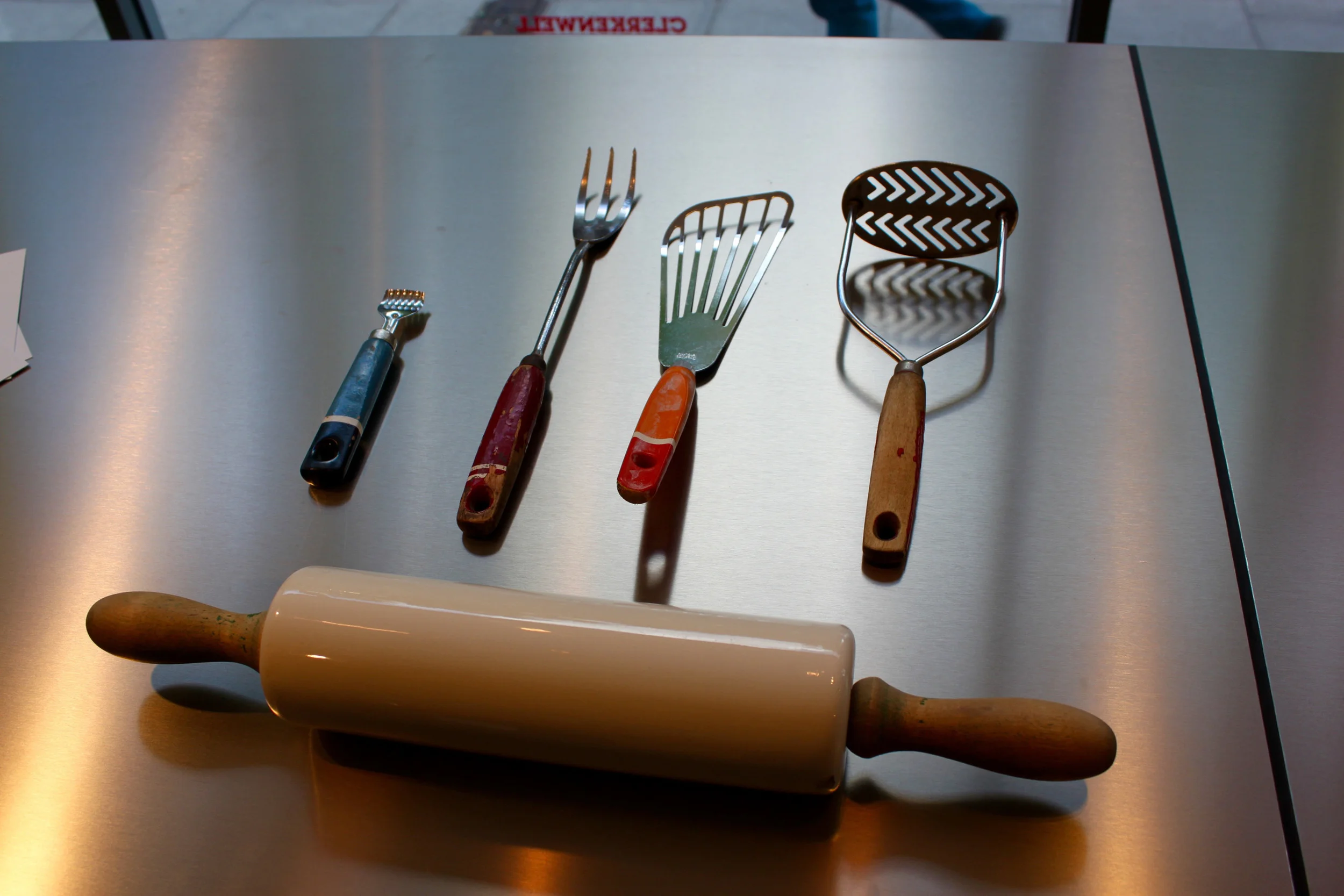
We were also intrigued to see their arrangements of vintage tools and furnishings. In line with the young designers from our previous blog post, bulthaup also seems to be harking back and drawing influence from classic and older design sources.
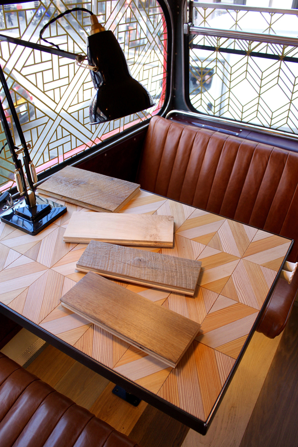
Havwoods certainly went for a standout display method, their collection of exquisite wood floors was showcased atop an old fashioned Routemaster bus. Havwoods flooring can really transform a room, their exquisite quality and range of finishes would suit both a classic and modern interior.


